Data Snapshots Image Gallery
Historic Probability of Severe Weather
- Dataset Details
- One image for each day of the year
- Download Directories
- Click on any of the links below to view a directory listing of images and assets related to this dataset.
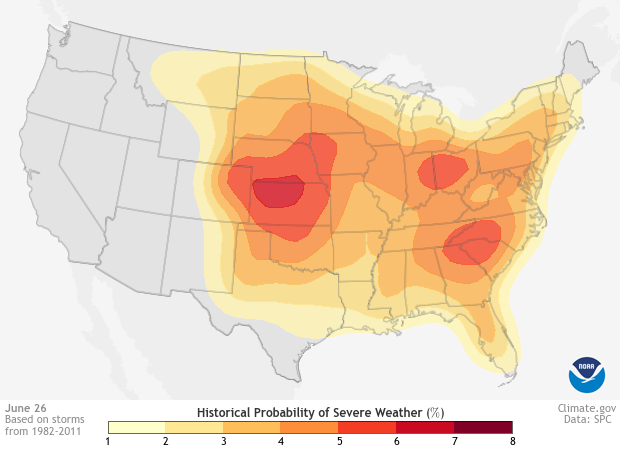
Shading on each map reflects how often severe weather occurred within 25 miles during a 30-year base period. The darker the shading, the higher the number of severe weather reports near that date. For this map, severe weather encompasses tornadoes, thunderstorm winds over 58 miles per hour, and hail larger than three-quarters of an inch in diameter.
For each day of the year, scientists plotted reports of severe weather from 1982 to 2011 on a gridded map. To reveal the long-term patterns of these events, they applied mathematical filters to smooth the counts in time and space. Keep in mind that severe weather is possible at any location on any day of the year.
Shaded areas show the historical probability of severe weather occurring within 25 miles. Meteorologists estimated these probabilities from severe weather reports submitted from 1982-2011. For each day of the year, scientists plotted reports of severe events onto a map marked with grid cells 50 miles on a side. For each grid cell, they counted the number of years with at least one report, and divided by the total number of years. To reveal the long-term patterns suggested by this relatively small dataset, they used statistical methods to smooth the data. For instance, to smooth clusters of events in time, a mathematical filter replaced the value in every grid cell with a 15-day average. Another filter extended report locations over a 25-mile-wide circle to indicate the probability that the event could have occurred at other points within that area.
Knowing when and where severe weather tends to occur through the year promotes preparedness. Residents who are alert to the possibility of severe weather are better able to respond in ways that keep them safe. These data can also help emergency response personnel plan for when and where their services may be necessary.
Data Snapshots are derivatives of existing data products: to meet the needs of a broad audience, we present the source data in a simplified visual style. NOAA's National Weather Service Storm Prediction Center produced the Severe Weather Climatology files. To produce our images, we obtained the climatology data as a numpy array, and ran a set of scripts to display the mapped areas on our base maps with a custom color bar.
Data for these images represents an update and extension of work first put forth by Dr. Harold Brooks of the National Severe Storms Laboratory.
References
Brooks, H. E., C. A. Doswell, III, and M. P. Kay, (2003) Climatological estimates of local daily tornado probability, Wea. Forecasting, 18, 626-640.
- Data Provider
- NOAA / NWS Storm Prediction Center
- Source Data Product
- NWS SPC Severe Weather Climatology (1982-2011)
- Access to Source Data
- Request data access via email to spc.feedback@noaa.gov
- Reviewer
- Patrick Marsh, NOAA Storm Prediction Center
