
Image caption
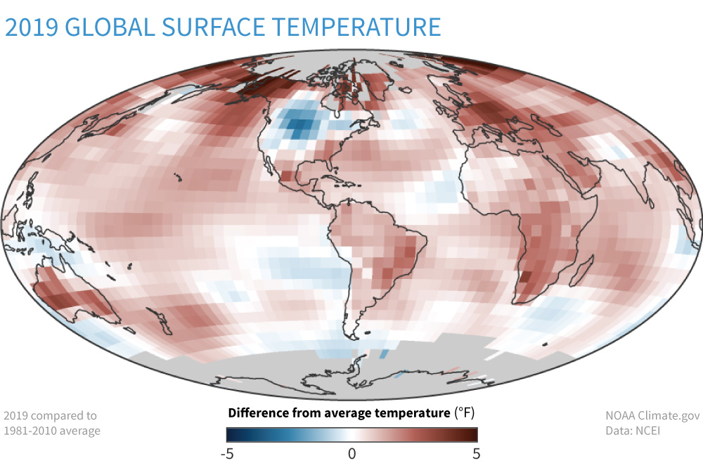
This map shows temperature anomalies for 2019, compared to the 1981–2010 average. Above-average temperatures appear in shades of red; below average temperatures appear in blue. Although below-average temperatures predominated in North America in 2019, above-average temperatures occurred across most of the globe. Map by NOAA Climate.gov based on data from NCEI.