
Image caption
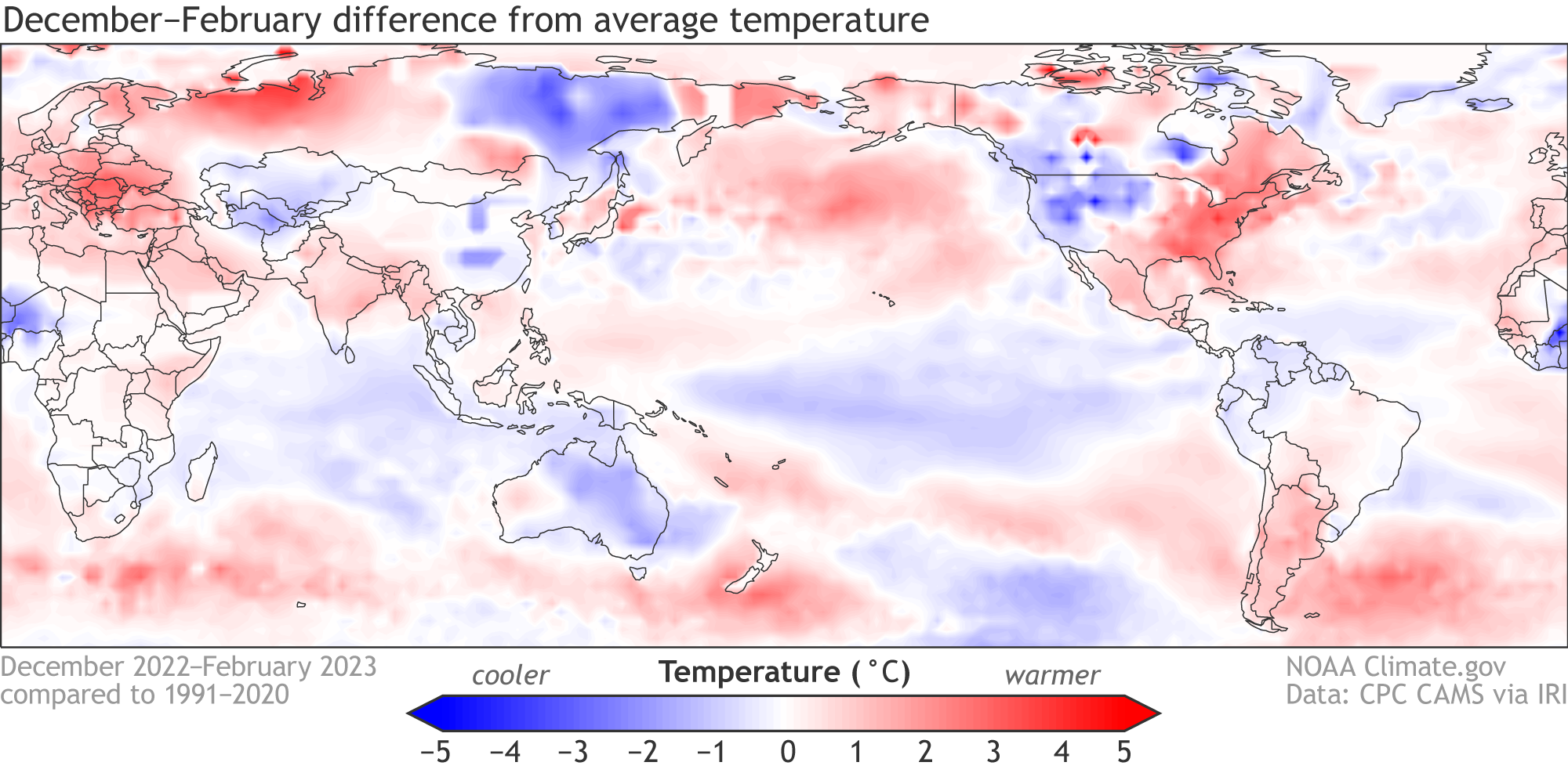
Global temperature patterns during December–February 2022–23. Temperature is shown as the departure from the long-term (1991–2020) average. Red indicates warmer-than-average and blue indicates cooler-than-average conditions. Climate.gov figure from CPC CAMS data, obtained from the IRI Data Library.