Do recent global precipitation anomalies resemble those of El Niño?
Since October 2014, sea surface temperatures (SST) across the tropical Pacific have exceeded the thresholds of weak El Niño (1), but the atmosphere has failed to really participate. Otherwise, we’d have seen above-average convection (thunderstorm activity) in the central tropical Pacific Ocean, a weakening of the surface trade winds, and a lowering of the Southern Oscillation Index and the Equatorial Southern Oscillation Index (2)—none of which showed up consistently.
However, how much does the atmosphere matter? Can the warm SSTs alone have global climate impacts? While the answer may vary depending on location and type of impact (3), here we ask whether the most recent season (the November 2014-January 2015 average) showed global precipitation responses that resemble those expected during El Niño.
What was the global precipitation pattern during November 2014 to January 2015?
Figure 1 shows the pattern of the deviations from average (or “anomalies”) of precipitation across much of the globe for the November to January average. The brown color shows regions receiving below average rain and/or snow, and green shows above average.
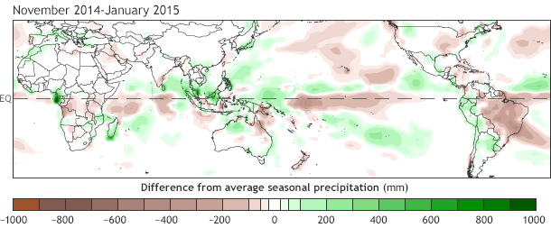
Figure 1. Observed precipitation from November 2014–January 2015, compared to the long-term average (in mm). Below-average rainfall is shown in brown; above-average rainfall is green. Data from CAMS_OPI, produced at NOAA/Climate Prediction Center.
Over the United States, much of the Ohio and Mississippi valleys were somewhat drier than average, while southern Texas and part of Florida were wetter than average. In South America, most of Brazil had below average rainfall. How do these patterns, and the many other features shown in Fig. 1, compare with the historically expected patterns during El Niño?
What should it have looked like?
Figure 2 shows the expected pattern of El Niño precipitation anomalies for November-January, based on an analysis of the historical data from 1981 to the present (4). At first glance, the historical El Niño pattern does not look much like what happened this year. For example, in the United States during El Niño, above average rainfall would be expected across a wider range of the southern United States. The area of below average precipitation in the Ohio and Mississippi valleys in the recent observations is broader than seen in the historical El Niño pattern (See footnote 5 for more detail for the United States).
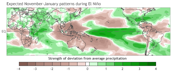
Figure 2. Geographic pattern of deviation from average precipitation expected for November-January during El Niño, based on a statistical analysis of data from 1981 to present. The "classic" El Niño rainfall signal in this season is above-average rainfall (green) in the east-central tropical Pacific, the southern United States and Mexico, and the Horn of Africa, with below-average rainfall (brown) around Indonesia, over the Caribbean and northern South America, and across southern Africa. Units are relative, not physical. Map based on analysis by Dr. Brad Lyon at IRI, Columbia University.
Outside of the United States, the most obvious disagreement between the typical El Niño pattern and what occurred this year is in the central and east-central tropical Pacific Ocean itself, where the observed rainfall was below average while during El Niño it would nearly always be above average. El Niño normally is associated with below average rainfall over Indonesia and northern Australia, which was generally not observed this year. The same can also be said about southern Africa. In South America, on the other hand, there is moderate (but far from perfect) agreement with the expected El Niño anomalies. So, overall, how did the observations stack up?
And now the math...
While “eyeballing” two maps for similarity is adequate as a first step, if we want to be scientific about it, we should adopt a more objective and quantitative measure of how well they match. Figure 3 shows such a measure (6), not only for this year but also for the November to January season for every year since 1981. The blue line shows the degree of agreement between the observed pattern and the expected El Niño pattern. Large positive values indicate strong agreement (e.g., 1997-98), large negative values strong disagreement (e.g., 1988-89, when there was a strong La Niña, and the pattern was there but was in the opposite direction), and values close to zero indicate a lack of relationship between the pattern of the observations and the expected El Niño pattern.
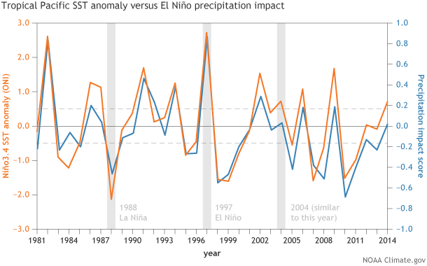
Figure 3. The relationship between November-January sea surface temperature (SST) in the east-central tropical Pacific and global rainfall impacts during the same season since 1981. SST anomalies are shown by Oceanic Niño Index values (orange line). The date on the x-axis shows the start year of each November-January period. The blue line (Precipitation Impact Score) shows how closely the observed rainfall pattern for each November-January season matched the typical anomalies associated with El Niño (shown by Figure 2.) When the orange line is above 0, but the blue line is not (such as in 2014), El Niño-like warming is present, but the typical El Niño-related rainfall patterns did not emerge. NOAA Climate.gov graph by Fiona Martin, based on analysis and data from Dr. Brad Lyon, IRI, Columbia University.
The orange line In Fig. 3 shows the strength of ENSO based on the Oceanic Niño Index (ONI) (i.e., the Niño-3.4 SST index). For this year, we see that the similarity score was close to zero, showing the lack of a match between observed precipitation pattern and that expected during El Niño. This is despite the fact that the tropical Pacific SSTs alone (the ONI) were at thresholds consistent with a weak El Niño (i.e., ≥0.5˚C). Relative to 2014-15, Fig. 3 shows that other years with ONI values above 0.5˚C were often associated with larger agreement.
Interestingly, another year that rivals this year, with SST ≥0.5˚C but <1.0˚C, and a comparative lack of global precipitation impacts, is 2004-05. That year qualified as an El Niño episode via the ONI, but had a lack of atmospheric impacts over the tropical Pacific Ocean. 2004-05 was also a year that was not defined as an El Niño by the WMO or the Bureau of Meteorology in Australia. Usually, though, years with ONI values that qualify for El Niño events are associated with notably positive agreement between the observed precipitation anomalies and the historical El Niño pattern—especially strong events.
Bottom Line: So far in 2014-15, we have not seen large-scale precipitation anomalies over the globe (including the United States) that clearly resemble those expected during El Niño. Why not?
In general, global climate effects come about when the atmosphere over the warmed tropical Pacific Ocean triggers a chain of events leading to global circulation changes and related precipitation teleconnections. The crucial required feature is above-average heating in the tropical upper atmosphere, resulting from above-average convection (thunderstorm activity).
Here’s the key thing: above-average convection is caused not just by the warm sea temperature. It is also linked to the low-level trade winds over the ocean and the associated atmospheric pressure patterns that are part of the Pacific Walker circulation. Changes in the equatorial Pacific circulation then strengthen the poleward air currents of the Hadley circulation (7). A stronger Hadley circulation then induces changes in atmospheric circulations outside of the tropics, including jet streams that govern the paths of mid-latitude cyclones and the positioning of downstream ridges and troughs that govern the weather systems at the surface (highs, lows, frontal systems, winds, warm and cold sectors).
Given the chain of events just described and the “missing” atmospheric response over the tropical Pacific Ocean, we would not expect El Niño-like global impacts during the last three months. So, it’s not surprising that we aren’t seeing them, despite what the ocean is doing.
Hopefully, the analysis above will help in understanding why an El Niño advisory has not been posted to date. ENSO is a coupled phenomenon, and without atmospheric participation the impacts on the global climate are not set into motion. Although we do care about the fish in the tropical Pacific—which might be experiencing some of the impacts of changes in sea surface temperature—our El Niño advisories are intended more for the two-legged creatures who live on land and who need precipitation to grow their crops and fill their reservoirs, but dread extreme flooding. For them, the climate impacts are what matter.
Footnotes
(1) The Oceanic Niño Index (ONI), the sea surface temperature averaged in the Niño3.4 region of the east-central equatorial Pacific Ocean, was 0.5°C for the September to November 2014 3-month average, 0.7°C for October to December, and 0.7°C for November to January. For the three individual months within November to January, the values were 0.8°C, 0.7°C and 0.5°C , respectively.
(2) The traditional Southern Oscillation Index is based on the atmospheric pressure at Tahiti, in French Polynesia, minus the pressure at Darwin, Australia. Both stations are south of the equator. The Equatorial Southern Oscillation Index is based on the atmospheric pressure along the equator averaged over a large rectangular area in the eastern Pacific, minus the pressure in a large rectangular area over Indonesia. These indices are shown in a diagram in an earlier blog.
(3) As we have pointed out in earlier blog posts, countries located closer to the tropical Pacific, and which are sensitive to the impacts of warm SSTs alone, may be feeling the affects of this “almost El Niño” more than the regions located outside of the Pacific basin and vicinity.
(4) This historical analysis uses a statistical method, called empirical orthogonal functions (EOF) analysis (which is highly related to principal components analysis, or PCA), to identify “preferred patterns,” which are patterns that tend to occur more frequently over a given time span than would be expected randomly. The pattern of deviations of precipitation from average that is associated with ENSO extremes (El Niño and La Niña) turns out to be the strongest of any climate pattern detected in the historical record, so it can be fairly accurately described. (The same is not the case for temperature, where a global warming trend shows up at least as strongly as the ENSO signature.) The pattern shown in Fig. 2 is compatible with the mainly low latitude teleconnections described by Bjerknes (1969), and agree with the global El Niño-related precipitation composites implied in Ropelewski and Halpert (1987), and those shown in Mason and Goddard (2001).
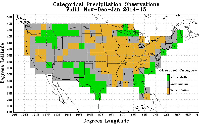
(5) In addition to the precipitation anomaly map shown in Fig. 2, I’ve broken the precipitation observations in the mainland United States for the November 2014 to January 2015 season down by tercile category—that is, whether they fall into the above-normal, near-normal, or below-normal category, where each of those categories is defined so they occur one-third of the time over a recent 30-year period. (Click here to see a map of the above categorical observations.)
The areas covered by the above normal and below normal category turn out to be larger than the green and brown areas seen over the United States in Fig. 1. For example, one half or more of the following states fall into the above-normal category: Idaho, Montana, New Mexico, Texas, Florida, Georgia, South Carolina and New Jersey. The below-normal category was observed in one-half or more of quite a large set of states: Minnesota, North Dakota, South Dakota, Nebraska, Wisconsin, Illinois, Indiana, Ohio, Pennsylvania, New York, Kansas, Oklahoma, Missouri, Arkansas, Louisiana, Mississippi, Tennessee, Kentucky, and West Virginia.
NOAA/Climate Prediction Center’s half-month lead forecast for this season, made in mid-October (enter year 2014 and month 10 in the menu on this page to see the forecast), resembled the pattern of above- and below-normal precipitation expected with weak El Niño. The verification score (the Heidke skill score) turned out to be 8%, which, although positive, is below the long-term average of 13% for all seasons since 1995 and for only forecasts that are not for climatology (i.e., for equal chances for all three categories; see our earlier blog).
Since the occurrence of an ENSO extreme (El Niño or La Niña) often provides a boost in the skill score (Goddard and Dilley 2005; Barnston et al. 2010), it is clear that tilting the odds toward the expected weak El Niño impacts this year did not give us a bang for our buck. Of course, the winter is not over, and we still have to see if the lack of appreciable El Niño impacts in the United States extends into the December -February and January-March seasons as well.
(6) Here, the similarity is based on a mathematical comparison between the value of the deviation from average this year (Fig. 1) versus the deviation of the value on the “expected” map (Fig. 2) taken grid point by grid point, covering all grid points over the maps. So, strong agreements (or disagreements) at corresponding grid points sway the final result more than small agreements (or disagreements). If the grid points agree and disagree in a completely random manner, the score is zero, while if disagreements are stronger or more numerous than agreements the score is negative (as would be expected during La Niña events).
(7) The Hadley circulation is forced by rising warm air in the tropical Pacific because the tropics are generally the warmest latitudes on the planet. When this rising air reaches the upper atmosphere, it branches away from the equator and moves toward the higher latitudes, both northward and southward, contributing to the complex circulation patterns that help establish the average worldwide climate features. This poleward movement of air in the upper atmosphere, followed by sinking motion over the subtropics, and the return flow at lower levels of the atmosphere toward the lower pressure at the equator, makes up the Hadley circulation (see the diagram in the top figure of our earlier blog).
References
Barnston, A. G., S. Li, S. J. Mason, D. G. DeWitt, L. Goddard and X. Gong, 2010: Verification of the First 11 Years of IRI's Seasonal Climate Forecasts. J. Appl. Meteor. Climatol, 49, 493-520.
Bjerknes, J., 1969:. Atmospheric teleconnections from the equatorial Pacific. J. Phys. Oceanog., 97, 163-172.
Goddard, L., and M. Dilley, 2005: El Niño: Catastrophe or opportunity? J. Climate, 18, 651-665.
Mason, S. J., and L. Goddard, 2001: Probabilistic precipitation anomalies associated with ENSO. Bull. Amer. Meteor. Soc., 82, 619-638.
Ropelewski, C. F., and M. S. Halpert, 1987: Global and regional scale precipitation patterns associated with the El Niño/Southern Oscillation. Mon. Wea. Rev., 115, 1606-1626.
Comments
Geophysics
Add new comment