So far in 2014, much of the United States has been unusually cold. Not only that, but much of the United States has been unusually warm.
But wait, you say, you can’t have it both ways! Can you?
Typically, the answer to that question is no. But 2014 has not been typical. Never before have such large areas of the country experienced such radically different temperature extremes as they have so far this year. The map below shows just how divergent the temperature patterns have been across the contiguous United States for January-July 2014.
Minimum temperatures (“overnight lows”) for much of the Upper Midwest and the Mississippi Valley were much cooler than average—with a lone “record coldest” minimum temperature in Oklahoma—while a number of climate divisions across the Southwest, including drought-stricken California had record warm overnight lows.
The graph below shows January-July temperature extremes in a different way: the bars represent the percent of the country experiencing extremely warm or cold average maximum temperature (“daytime high”) during the first part of each year since 1910. For this analysis, an extreme means in the top or bottom 10% of the historical range of values recorded for a location.
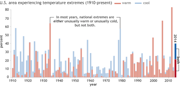
Graph of percent U.S. area affected by extremes in maximum temperature (red is warm, blue is cool) in January-July 2014, based on data from the U.S. Climate Extremes Index (Step 1) from the National Climatic Data Center.
In most years in the record, extremes are significantly lopsided: a given year’s bar is mostly red or mostly blue, sometimes capped with a small segment of the opposite color. In other words, either some part of the country is experiencing warm extremes or cold extremes, but not both. Only a handful of years have a pattern similar to 2014—in which more than 10 percent of the country was experiencing extreme warmth while a similarly large or larger area experienced extreme coolness. Can you spot them all?
Even among these years, 2014 is unprecedented: never before has the country experienced such large areas of simultaneous, opposing temperature extremes in the same January-July period. At a combined 40% of the country, the area affected by extremes so far this year is nearly double the size you’d expect due to chance.
(As an aside, also notice how the graph becomes skewed toward warm extremes in more recent decades: this is yet another metric for how climate is changing.)
In an upcoming post, we will explore some of the weather and climate patterns behind the usually extreme U.S. temperatures.