Data Snapshots Image Gallery
Projections - Average Mean Temperature, High Emissions
- Dataset Details
- Monthly images by decade from 2010 to 2099
- Download Directories
- Click on any of the links below to view a directory listing of images and assets related to this dataset.
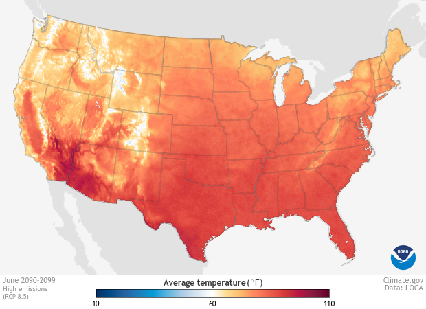
Colors show projected average daily temperature for each month from the 2020s through the 2090s, based on a high-emissions future.
In this case, the high-emissions future represents a specific Representative Concentration Pathway (RCP) called RCP 8.5. Learn more about RCPs »
Temperature projections in these images represent output from 32 global climate models that are all part of the Coupled Model Intercomparison Project Phase 5 (CMIP5). Projections labeled as “High emissions” represent a potential future in which global emissions continue increasing through the 21st century. By 2100, the result of this pathway is climate forcing of 8.5 Watts per square meter at the top of the atmosphere. Based on the energy imbalance along this pathway, global climate models calculate temperature across Earth’s surface for future periods. The RCP 8.5 scenario represents a future in which no climate policies are enacted.
To produce regionally relevant projections, results from the global models were statistically downscaled using a method called Localized Constructed Analogs (LOCA). This technique uses observed local-scale weather and climate information to increase the spatial resolution of global-scale projections, and corrects for bias in the model simulations.
Images of long-term averages from 1981 to 2010 (PRISM normals) show recent conditions; these maps provide a baseline for comparison with future projections. To produce the normals data, the PRISM group at Oregon State University gathered temperature and precipitation records from a range of federal, state, and international weather station networks, and then mapped them to a grid. To fill map areas between observation stations, the group used a digital elevation model as a predictor grid, and refined the model to account for local effects of mountains, distance from coasts, and other factors that affect climate in complex terrains.
Shades of blue show where average temperature for the month was, or is projected to be, below 60°F during the period indicated. The darker the shade of blue, the lower the temperature. Areas shown in shades of orange and red had, or are projected to have, average temperatures over 60°F. The darker the shade of orange or red, the higher the temperature. White or very light colors show where the average temperature was, or is projected to be, near 60°F.
In order to meet future needs for energy, food, and public health, planners and other decision makers need to understand how temperatures are projected to change over the coming decades. As the climate system continues responding to the heat-trapping gases we have added to the atmosphere, temperatures will change at different rates in different regions. These images can help people get a sense of how much warming their region will experience each decade so they can plan ahead for new conditions.
These data also provide people with a way to compare conditions projected for stabilized emissions with conditions projected for high emissions. Comparing the two potential futures may encourage people to take actions to reduce emissions.
We used a suite of Python scripts to process and visualize LOCA (Localized Constructed Analogs) data. The processing scripts averaged the daily values for each month in a given decade from all 32 global climate models that comprise the LOCA dataset. We then calculated the median of all models in each month of the decade. The visualization scripts produced maps of the results within the contiguous United States.
For further information, see the README file or access the scripts on GitHub ».
Observed temperatures for the last three decades (1981-2010) fall mostly within the range from 0-100°F; this is the temperature range we used to produce sets of 30-yr average temperature maps for Data Snapshots. The range was selected to reveal patterns of recent temperature across the maps.
In order to generate a consistent set of maps that represent recent AND future temperatures, we needed to show temperatures from 10-110°F. Therefore, if you compare Data Snapshots’ PRISM normals images with our 30-year average images side-by-side, you will see slightly different colors representing the same data values. Always interpret color-coded images by checking the numerical values shown on their color bars.
References
Pierce, D. W., D. R. Cayan, and B. L. Thrasher, 2014: Statistical Downscaling Using Localized Constructed Analogs (LOCA). Journal of Hydrometeorology, volume 15, page 2558-2585.
Descriptions of PRISM Spatial Climate Datasets for the Conterminous United States
- Data Provider
- UCSD and Scripps Institution of Oceanography
- Source Data Product
- NASA NEX Open Data / LOCA Projections
- Access to Source Data
- LOCA Decadal Temperature Projections
- Reviewer
- Jay R. Alder, U.S. Geological Survey
