Data Snapshots Image Gallery
Ocean Heat Content - Seasonal Difference from Average
- Dataset Details
- Seasonal, three-month images from 2000 to present
- Download Directories
- Click on any of the links below to view a directory listing of images and assets related to this dataset.
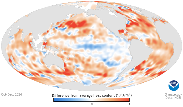
Colors on the map show where instruments detected more or less heat energy in the top 2,300 feet of water than the long-term average annual heat content. Orange areas show where heat content was higher than the long-term average. Blue areas show where heat content was lower than the long-term average. The darker the shade of blue or orange, the larger the heat-content difference from the long-term average.
Oceanographers use a range of temperature-sensing instruments to measure heat energy in the ocean. Among them is a fleet of more than 3,000 robotic “floats” that measure ocean temperature in the top 2,300 feet of water. Scientists constantly compare data from floats, probes, and Conductivity-Temperature-Depth (CTD) sensors to verify that the values they produce make sense.
Colors show the relative differences in average heat energy in the top 2,300 feet of the ocean, computed for each year, compared to long-term average annual heat content. The long-term temperature climatology is the average of five “decadal” climatologies calculated for 1955-1964, 1965-1974, 1975-1984, 1985-1994, and 1995-2006. Orange and blue areas show where the upper ocean’s heat storage rose or fell by up to 3 gigajoules (109 joules) per square meter at the surface. Areas where heat content was close to the long-term average are white.
The ocean’s ability to store and release heat over long periods of time gives it a central role in stabilizing Earth’s climate system. Short-term variations in heat content due to natural climate patterns like El Niño influence regional climates, tropical cyclones, and marine life, including coral reefs and fisheries. As the ocean takes up more heat due to global warming, water temperatures rise, causing it to increase in volume, raising global sea level around the world. Warming ocean waters also have major implications for marine ecosystems, melting ice caps, and precipitation patterns.
Data Snapshots are derivatives of existing data products. To meet the needs of a broad audience, we present the same data as current products in a simplified visual style. This set of snapshots is based on data from NOAA’s Ocean Climate Laboratory.
To produce the maps for Data Snapshots, we run a script that accesses the source data, applies a custom color palette, and assembles them on a prepared base map.
References
Levitus, S., et al. (2012), World ocean heat content and thermosteric sea level change (0–2000 m), 1955–2010, Geophys. Res. Lett., 39, L10603.
- Data Provider
- NCEI Ocean Climate Laboratory OCL Products
- Source Data Product
- NCEI Global Ocean Heat and Salt Content Yearly and 3-Month 0-700m Heat Content
- Access to Source Data
- Seasonal Ocean Heat Content
- Reviewer
- Gregory C. Johnson, NOAA Pacific Marine Environmental Laboratory
