Data Snapshots Image Gallery
SST - Global, Monthly Difference from Average
- Dataset Details
- Monthly images from 2000 to present
- Download Directories
- Click on any of the links below to view a directory listing of images and assets related to this dataset.
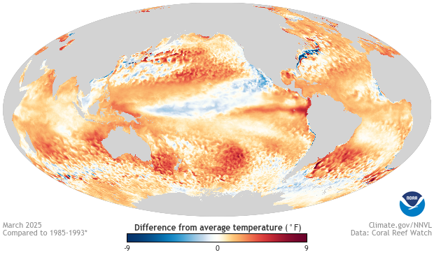
Colors on this map show where and by how much monthly sea surface temperature differed from a long-term average (1985-1993, details from Coral Reef Watch). Red and orange areas were warmer than average, and blue areas were cooler than average. The darker the color, the larger the difference from the long-term average. White and very light areas were near average.
These monthly measurements are made from NOAA's CoralTemp sea surface temperature (SST) data. Every day, instruments on eight satellites in two different orbits (geostationary and polar) measure sea surface temperature by checking how much energy is radiated by the ocean at different wavelengths. Computer programs plot these measurements on a gridded map and then merge and smooth the data into a gap-free product using mathematical filters. Each grid point covers an area approximately 5 x 5 km. Daily temperatures at each grid point are averaged together to calculate monthly average temperature.
To calculate the difference-from-average temperatures shown here, a computer program takes the monthly average temperature at each grid point, and subtracts the long-term average for that month. If the result is a positive number, the sea surface was warmer than the long-term average. A negative result from the subtraction means the sea surface was cooler than usual.
Shades of blue show locations where sea surface temperature was cooler than its long-term average. Locations shown in shades of orange and red are where the sea’s surface was warmer than the long-term average. The darker the shade of red or blue, the larger the difference from the long-term average or “usual” sea surface temperature. Locations that are white or very light show where sea surface temperature was the same as or very close to its long-term average.
Water covers more than 70% of our planet's surface. Tracking the temperature of the sea’s surface helps scientists understand how much heat energy is in the ocean and how it changes over time. Sea surface temperatures can have dramatic impacts on weather, including weather patterns such as El Niño-Southern Oscillation (ENSO) that travel hundreds of miles inland. Sea surface temperatures also play a significant role in the extent and thickness of Arctic and Antarctic sea ice, which serve as our planet’s built-in air-conditioning system. And sea surface temperatures have significant effects on marine life. The upwelling of cold water, for instance, provides nutrients to phytoplankton, the base of the marine food chain. In contrast, warm ocean surface waters deprive phytoplankton of nutrients, sometimes with devastating effects up the chain.
Data Snapshots are derivatives of existing data products: to meet the needs of a broad audience, we present the source data in a simplified visual style. NOAA's Environmental Visualization Laboratory (NNVL) produces the Sea Surface Temperature Anomaly files. To produce our images, we run a set of scripts that access these NNVL source files, re-project them into a Hammer-Aitoff globe, and output them in a range of sizes.
References
- Data Provider
- NOAA Environmental Visualization Laboratory (NNVL)
- Source Data Product
- NOAA View - Climate - Observations - Ocean Temperature - Monthly
- Access to Source Data
- FTP monthly .png files
- Reviewer
- Tom DiLiberto
