Data Snapshots Image Gallery
Temperature - Global Yearly, Difference from Average
- Dataset Details
- Yearly images from 1850 to 2024
- Download Directories
- Click on any of the links below to view a directory listing of images and assets related to this dataset.
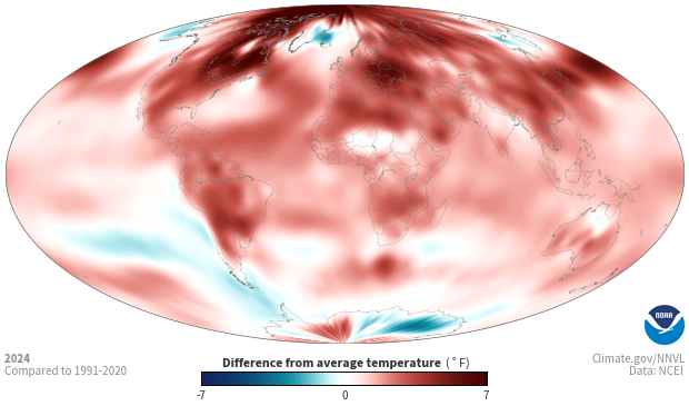
Colors show where average annual temperature was above or below its 1991-2020 average. Blue areas experienced cooler-than-usual temperatures for the year while areas shown in red were warmer than usual. The darker the color, the larger the difference from the long-term average temperature.
Weather stations on every continent record temperatures over land, and ocean surface temperatures come from measurements made by ships and buoys. NOAA scientists merge the readings from land and ocean into a single dataset. To calculate difference-from-average temperatures—also called temperature anomalies—scientists calculate the average annual temperature across hundreds of small regions, and then subtract each region’s annual average from 1991-2020. If the result is a positive number, the region was warmer than the long-term average. A negative result from the subtraction means the region was cooler than usual. To generate the source images, visualizers apply a mathematical filter to the results to produce a map that has smooth color transitions and no gaps.
Shades of red show where average annual temperature was warmer than the average from 1991–2020. Shades of blue show where the annual average was cooler than the long-term average. The darker the color, the larger the difference from average temperature. White and very light areas were close to their long-term average temperature. Gray areas near the North and South Poles show where no data are available.
Over time, these data give us a planet-wide picture of how climate varies over years and changes over decades. Each year, some areas are cooler than the long-term average and some areas are warmer. Though we don’t see an increase in temperature at every location every year, the long-term trend shows a growing portion of Earth’s surface is warmer than it was during the base period.
Data Snapshots are derivatives of existing data products: to meet the needs of a broad audience, we present the source data in a simplified visual style. NOAA's Environmental Visualization Laboratory (NNVL) produces the source images for the Difference from Average Temperature – Yearly maps. To produce our images, we run a set of scripts that access the source images, re-project them into desired projections at various sizes, and output them with a custom color bar.
Source images available through NOAA's Environmental Visualization Lab (NNVL) are interpolated from data originally provided by the National Center for Environmental Information (NCEI) - Weather and Climate. NNVL images are based on NOAA's Merged Land-Ocean Surface Temperature Analysis (MLOST).
References
- Data Provider
- NOAA Environmental Visualization Laboratory (NNVL)
- Source Data Product
- NOAA View - Climate - Observations - Surface Temperature - Yearly
- Access to Source Data
- FTP yearly .png files
- Reviewer
- Jessica Blunden, National Centers for Environmental Information
