Data Snapshots Image Gallery
Temperature - Maximum, 1991-2020 Monthly Average
- Dataset Details
- Twelve monthly images for 1991-2020
- Download Directories
- Click on any of the links below to view a directory listing of images and assets related to this dataset.
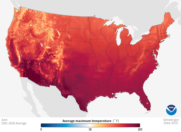
Based on daily observations from 1991-2020, colors on the map show the long-term average maximum temperature, sometimes referred to as the daytime or afternoon high, in 5x5 km grid cells for the month displayed. The map reveals the average of daytime high temperatures during the month over the previous three decades.
Daily temperature readings come from weather stations in the Global Historical Climatology Network (GHCN-D). Volunteer observers and automated instruments collected the highest temperature at each station every day from 1991 to 2020, and sent them to the National Centers for Environmental Information (NCEI). After scientists checked the quality of the data to omit any systematic errors, they calculated each station’s average monthly maximum temperature by taking the sum of all the daily maximum temperatures for a month (for example, all Junes in the 1991-2020 period) and dividing it by the total number of daily measurements (the number of days in the month times 30 years). NCEI scientists then plotted the values on a 5x5 km gridded map. To fill in the grid at locations without stations, a computer program interpolated (or estimated) values, accounting for the distribution of stations and various physical relationships, such as the way temperature changes with elevation. The resulting product is the NOAA Monthly U.S. Climate Gridded Dataset (NClimGrid).
The color in each 5x5 km grid cell shows the average of the highest temperature recorded every day of the month for the 30 years from 1991 to 2020. Shades of blue show where the highest daily temperatures measured from 1991 to 2020 averaged below 50°F for the month. The darker the shade of blue, the lower the temperature. Areas shown in shades of orange and red have long-term average maximum temperatures above 50°F. The darker the shade of orange or red, the higher the temperature. White or very light colors show areas where the average maximum temperature is near 50°F.
Understanding these values provides insight into the “normal” conditions for a month. This type of information is widely used across an array of planning activities, from designing energy distribution networks, to the timing of crop and plant emergence, to choosing the right place and time for recreational activities.
Data Snapshots are derivatives of existing data products: to meet the needs of a broad audience, we present the source data in a simplified visual style. This set of snapshots is based on NClimGrid climate data produced by and available from the National Centers for Environmental Information (NCEI). To produce our images, we invoke a set of scripts that access the source data and represent them according to our selected color ramps on our base maps.
The data used in these snapshots can be downloaded from different places and in different formats. We used this specific data source:
References
NOAA Monthly U.S. Climate Gridded Dataset (NClimGrid)
NOAA Monthly U.S. Climate Divisional Database (NClimDiv)
Improved Historical Temperature and Precipitation Time Series for U.S. Climate Divisions)
NCEI Monthly National Analysis)
Climate at a Glance - Data Information)
NCEI Climate Monitoring - All Products
- Data Provider
- National Centers for Environmental Information (NCEI)
- Source Data Product
- NOAA Monthly U.S. Climate Gridded Dataset (NClimGrid)
- Access to Source Data
- NCEI direct HTTPS download
- Reviewer
- Chris Fenimore, National Centers for Environmental Information
