Data Snapshots Image Gallery
Temperature - Three-Month Outlook
- Dataset Details
- Monthly images from 2016 to present
- Download Directories
- Click on any of the links below to view a directory listing of images and assets related to this dataset.
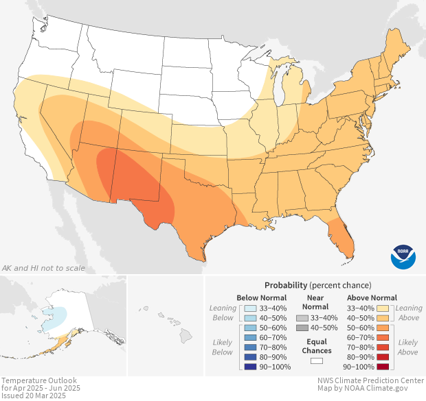
Shaded areas show where average temperature has an increased chance of being warmer or cooler than usual. The darker the shading, the greater the chance for the indicated condition. White areas have equal chances for average temperatures below, near, or above the long-term average for the month.
Climate scientists base future climate outlooks on current patterns in the ocean and atmosphere. They examine projections from climate and weather models and consider recent trends. They also check historical records to see what temperature conditions resulted from similar patterns in the past.
Colors on the map show experts’ level of confidence in their forecasts for above- or below-average temperatures. Each location on the map has some chance to experience average temperatures that rank in the bottom, middle, or top of records from the previous three decades. White areas have equal chances for all three conditions. Colors show where the odds for one of the conditions are higher than for the other two.
A common mistake is to interpret these maps as predicted temperatures. However, dark orange areas are not predicted to be warmer than light orange areas. The dark orange areas simply have a higher likelihood for above-average temperatures than the light orange areas do. Similarly, dark blue areas are not predicted to be cooler than light blue areas.
Keep in mind that outlooks show the most likely condition for each region, not the only possible outcome.
Energy companies want to know how much energy people will need in the next three months. Temperature outlooks can inform them when they should prepare to meet high demand for energy. Outlooks can also help them choose the best time to schedule maintenance procedures. Forestry managers also check temperature outlooks for the upcoming season. When they see increased chances for warmer-than-usual weather, they may take extra measures to prepare for more wildfires. Managers in agricultural industries also want to know if temperatures are likely to be warmer or cooler than usual. This information can help them optimize food production.
Data Snapshots are derivatives of existing data products: to meet the needs of a broad audience, we present the source data in a simplified visual style. NOAA's Climate Prediction Center (CPC) produces the source images for monthly temperature outlooks. To produce our images, we run a set of scripts that access mapping layers from CPC, re-project them into desired projections at various sizes, and output them with a custom color bar.
References
One-Month to Three-Month Climate Outlooks.
http://www.cpc.ncep.noaa.gov/products/forecasts/
- Data Provider
- Climate Prediction Center
- Source Data Product
- CPC Three-month Outlook Temperature Probability
- Access to Source Data
- FTP access to .shp files
- Reviewer
- Mike Halpert, Climate Prediction Center
