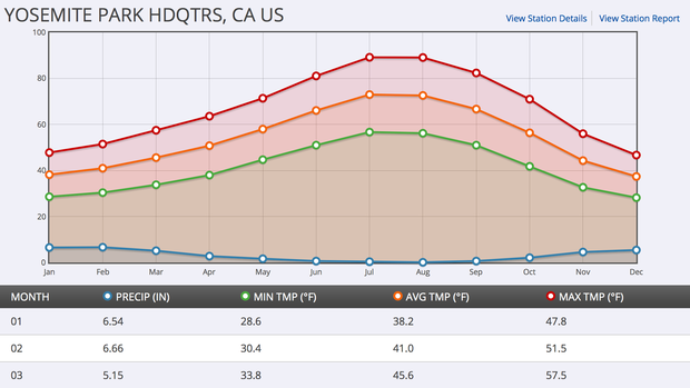
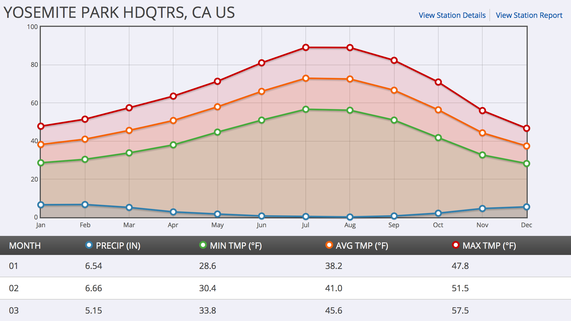
Simple graphs of U.S. Climate Normals for temperature and precipitation are one way to show a location's climate through the year, month, or day. Climate Normals reflect a weather station's previous three decades of observed weather.
Where do these data come from?
Weather stations around the country provide observational data over many decades. Measurements collected over 30 years—the most recent three full decades—are averaged to produce Climate Normals. Climate Normals are calculated using the best available data, which means removing missing or questionable data points. Climate Normals are updated every ten years: the currently used Normals are from 1991 - 2020.
-
What can I do with these data?
For locations in the U.S. check climographs to understand a location's average climate from the last three decades.
- Find out what conditions are normal in a place you intend to visit.
- What is the average maximum temperature during summer?
- Which months at a location usually have the most and least rain?
- How does geography affect climate at different cities along the same latitude?
How do I use the site?
- Click the tab for Monthly, Daily, Annual/Seasonal, or Hourly Normals
- Select a state and then a station location
- Place your cursor on points on the graph to read the data values
- A table of the data in your graph is below the graph. You can copy and paste these values into a spreadsheet for further analysis or to generate your own graphs.
-
Data Format(s)TXT (ASCII), CSV, PNG
Access Type Link & Description Graphing Produce climographs showing 1981-2010 Climate Normals for temperature and precipitation for over 9,800 stations across the United States. -
Data TypeLand-based stationEssential Climate VariablesAir temperature,Science OrganizationNOAA NCEIEmailncdc.orders@noaa.gov
 Click to see more detail
