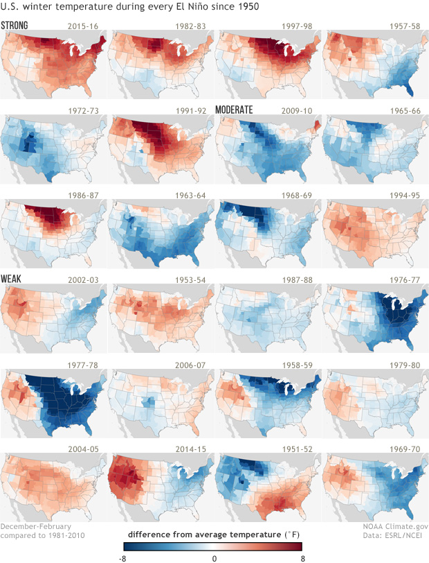
Image caption
Winter temperature patterns during each of the El Niño episodes since 1950. Dark red colors indicate much warmer than normal conditions, and dark blue colors indicate much colder than normal conditions. The top row corresponds with the strongest El Niño episodes, the two rows below correspond with moderate El Niño episodes, and the bottom three rows correspond with weak El Niño episodes. Maps by NOAA Climate.gov, based on NCDC climate division data provided by the Physical Sciences Division at NOAA ESRL.