
Image caption
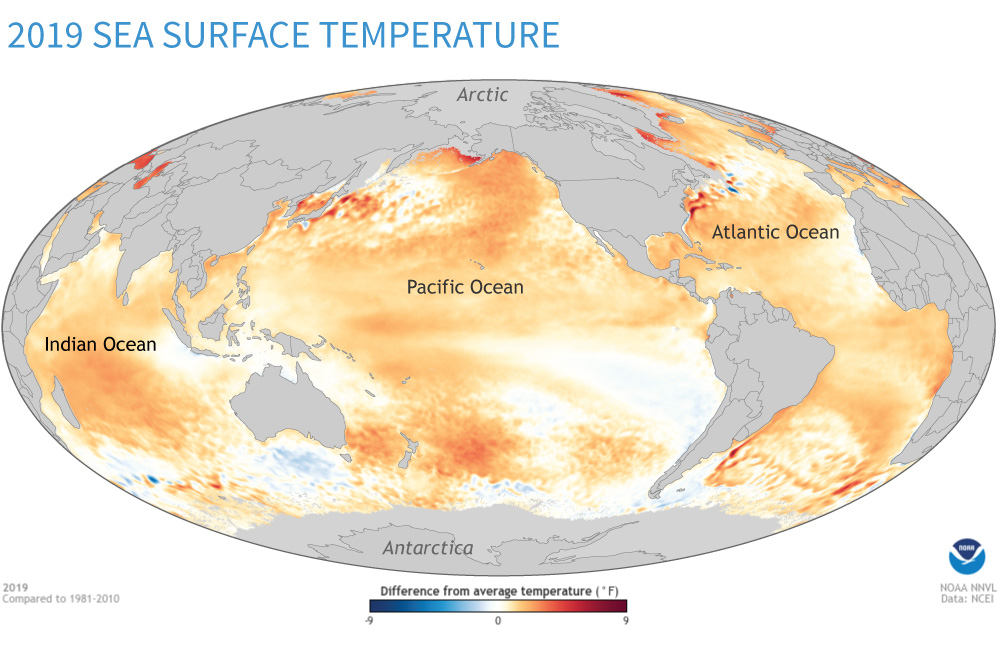
Across most of the world's oceans in 2019, sea surface temperature exceeded the long-term average in 2019. In this map, temperatures above the 1981–2010 average appear in shades of orange and red. Temperatures below the 1981–2010 average appear in blue. Map by NOAA Climate.gov based on data from NOAA NCEI.