
Image caption
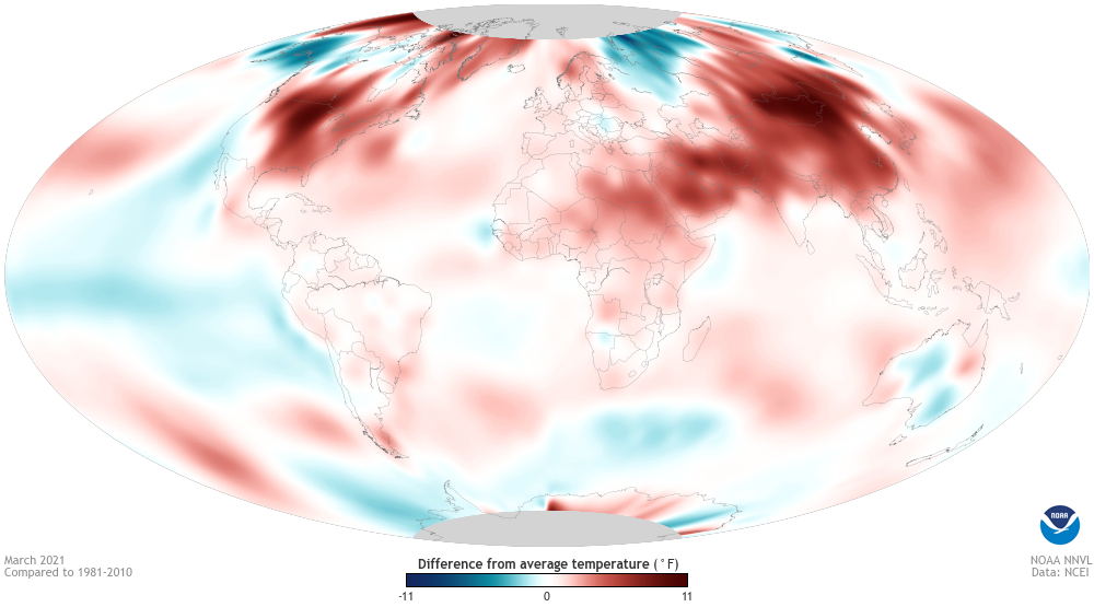
Surface temperatures on Earth in March 2021 compared to the 1981-2010 average. Places where temperatures were warmer than average are red; places where it was cooler than average are blue. NOAA Climate.gov map, based on data from NCEI.
Surface temperatures on Earth in March 2021 compared to the 1981-2010 average. Places where temperatures were warmer than average are red; places where it was cooler than average are blue. NOAA Climate.gov map, based on data from NCEI.