
Image caption
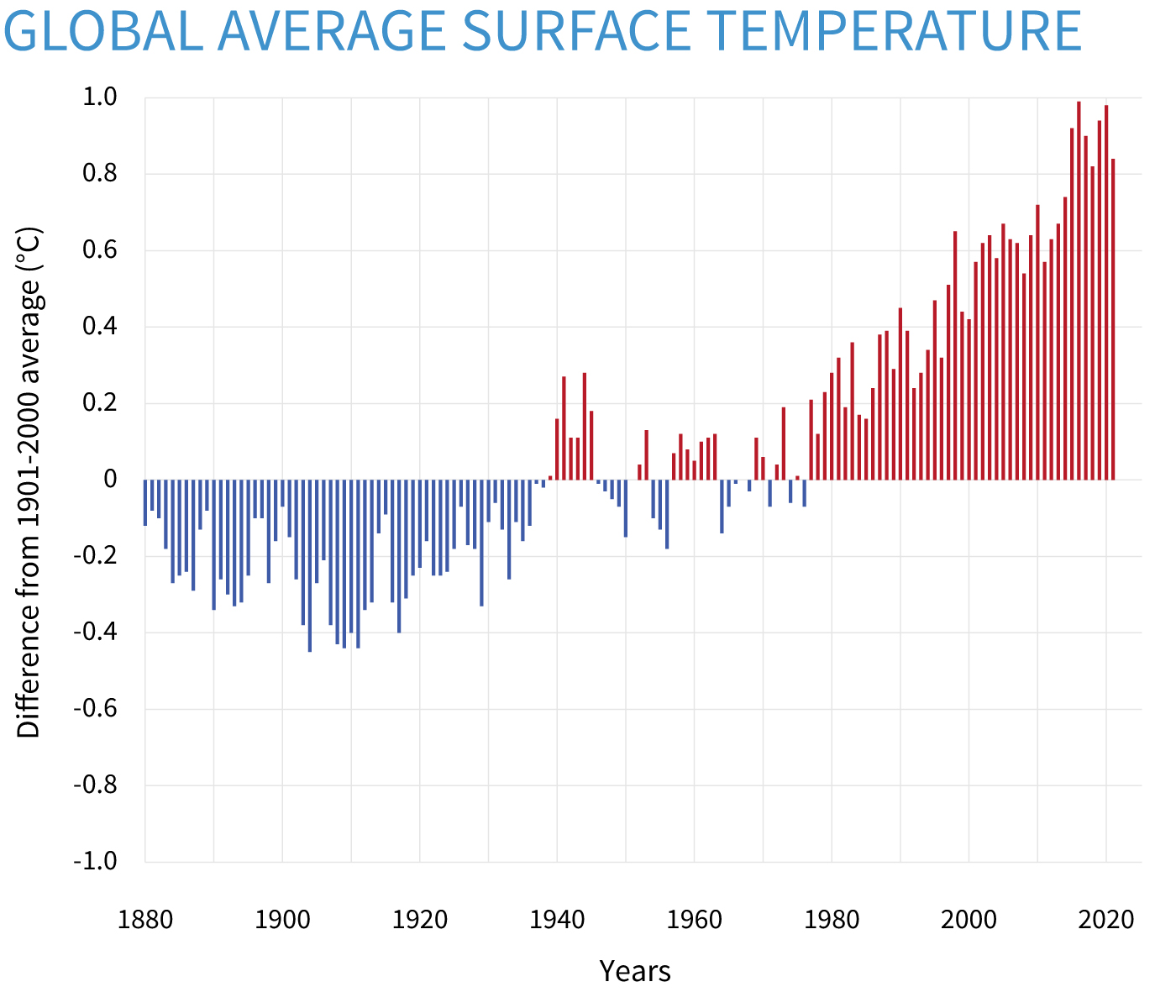
Yearly surface temperature compared to the 20th-century average from 1880–2021. Blue bars indicate cooler-than-average years; red bars show warmer-than-average years. NOAA Climate.gov graph, based on data from the National Centers for Environmental Information.