Image caption
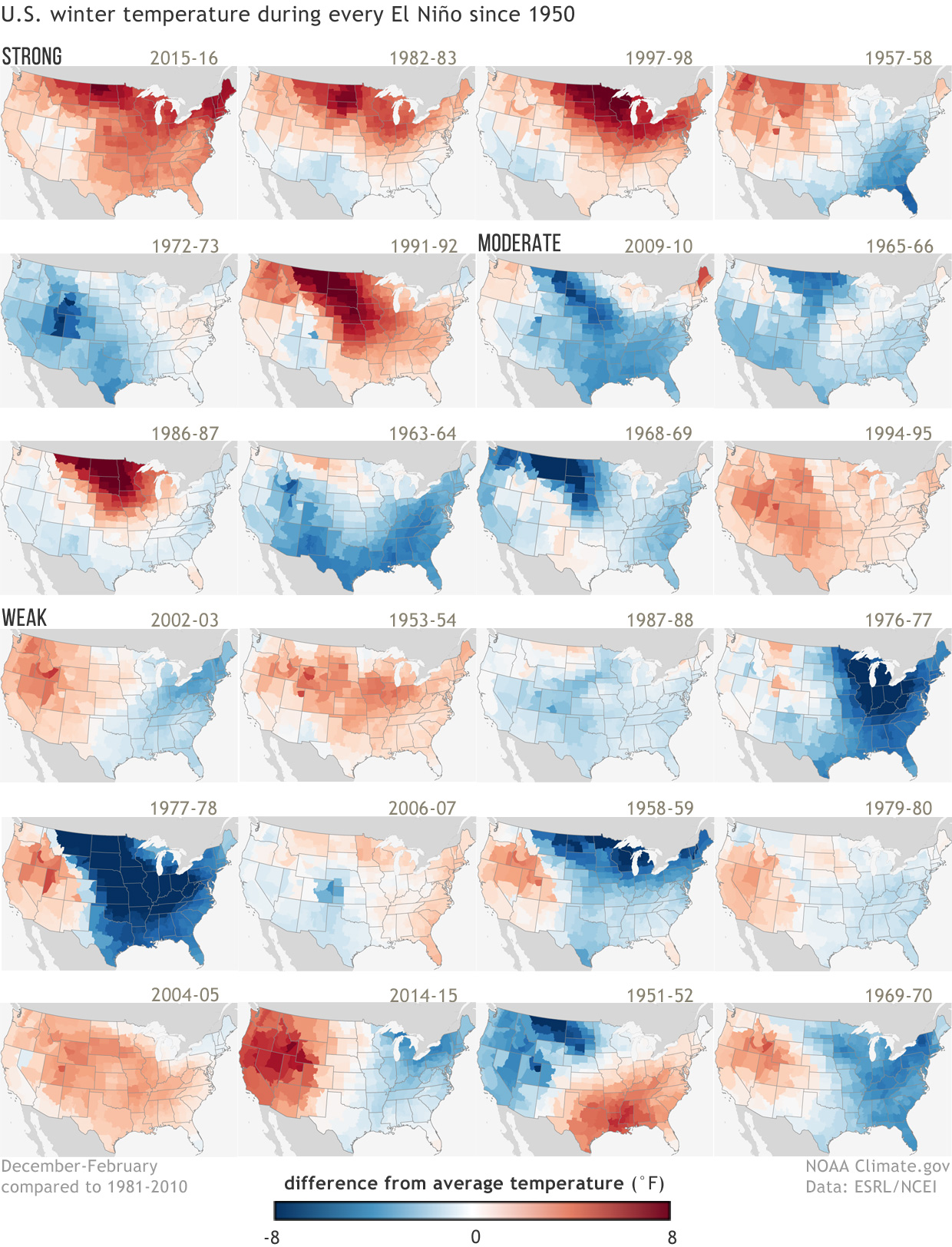
U.S. temperature patterns during the top 20 strongest El Niño winters from 1950-2015/16, arranged from strongest to weakest from top left to lower right. Places where the winter was warmer than the 1981-2010 average are red. Places where winter was cooler than average are blue. All events are somewhat different. In addition, because winters across the U.S. are getting warmer overall, using the 1981-2010 average for comparison can make cold anomalies during early events look especially cold, while warm anomalies may seem rather weak. NOAA Climate.gov maps, based on NOAA climate division data.