
Image caption
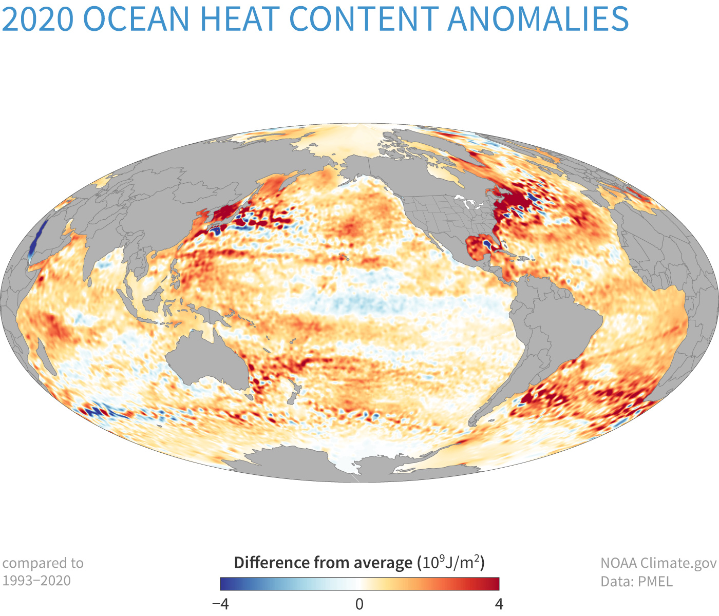
This map shows heat content anomalies—differences from the long-term average—in the top 700 meters (~2,100 feet) of the global ocean. Positive anomalies mean the ocean gained heat in 2020 (orange); negative anomalies mean the ocean lost heat energy (blue) in 2020. NOAA Climate.gov image, based on data provided by John Lyman.