
Image caption
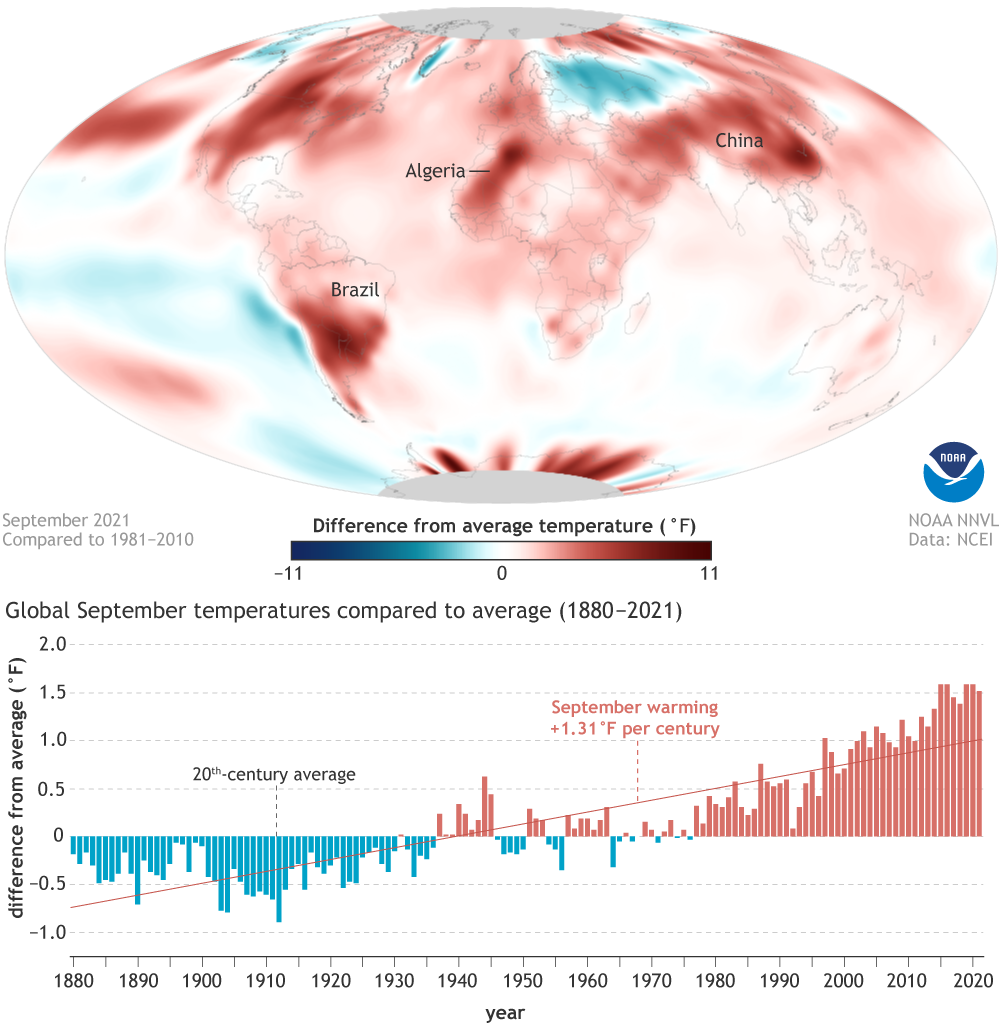
(top) Temperatures in September 2021 compared to the 1981-2010 average. Places where temperatures were warmer than average area red; places where temperatures were cooler than average are blue. (bottom) September temperatures compared to the 20th-century average each year from 1880 to 2021. Blue bars mean cooler-than-average Septembers; red bars mean warmer-than-average Septembers. NOAA Climate.gov image, based on data from NOAA NCEI.