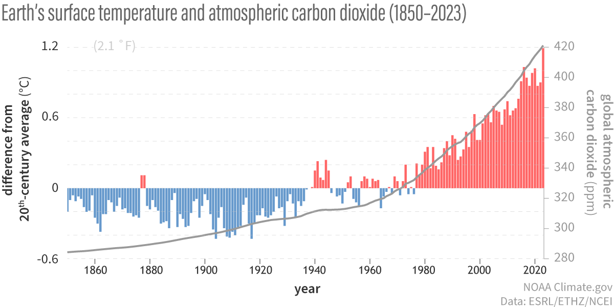
Image caption
(bar chart) Yearly temperature compared to the twentieth-century average from 1850–2023. Red bars mean warmer-than-average years; blue bars mean colder-than-average years. (line graph) Atmospheric carbon dioxide amounts: 1850-1958 from IAC, 1959-2023 from NOAA Global Monitoring Lab. NOAA Climate.gov graph, adapted from original by Dr. Howard Diamond (NOAA ARL).