
Image caption
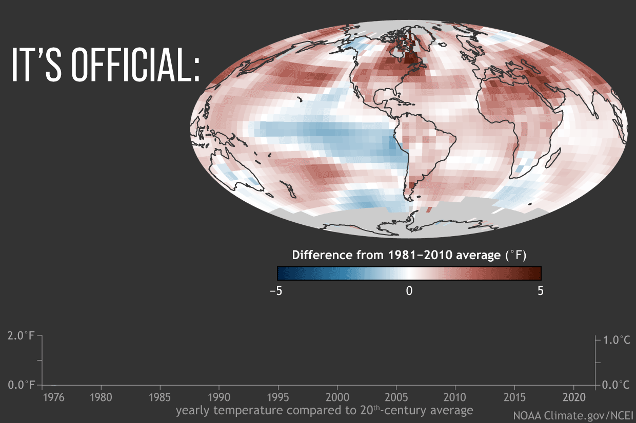
Map of global average surface temperature in 2021 compared to the 1981-2010 average, with places that were warmer than average colored red, and places that were cooler than average colored blue. The graph shows global temperatures compared to the 20th-century average each year from 2021 (right) back to 1976 (left)–the last year the world was cooler than average. NOAA Climate.gov image, based on data from NOAA NCEI.