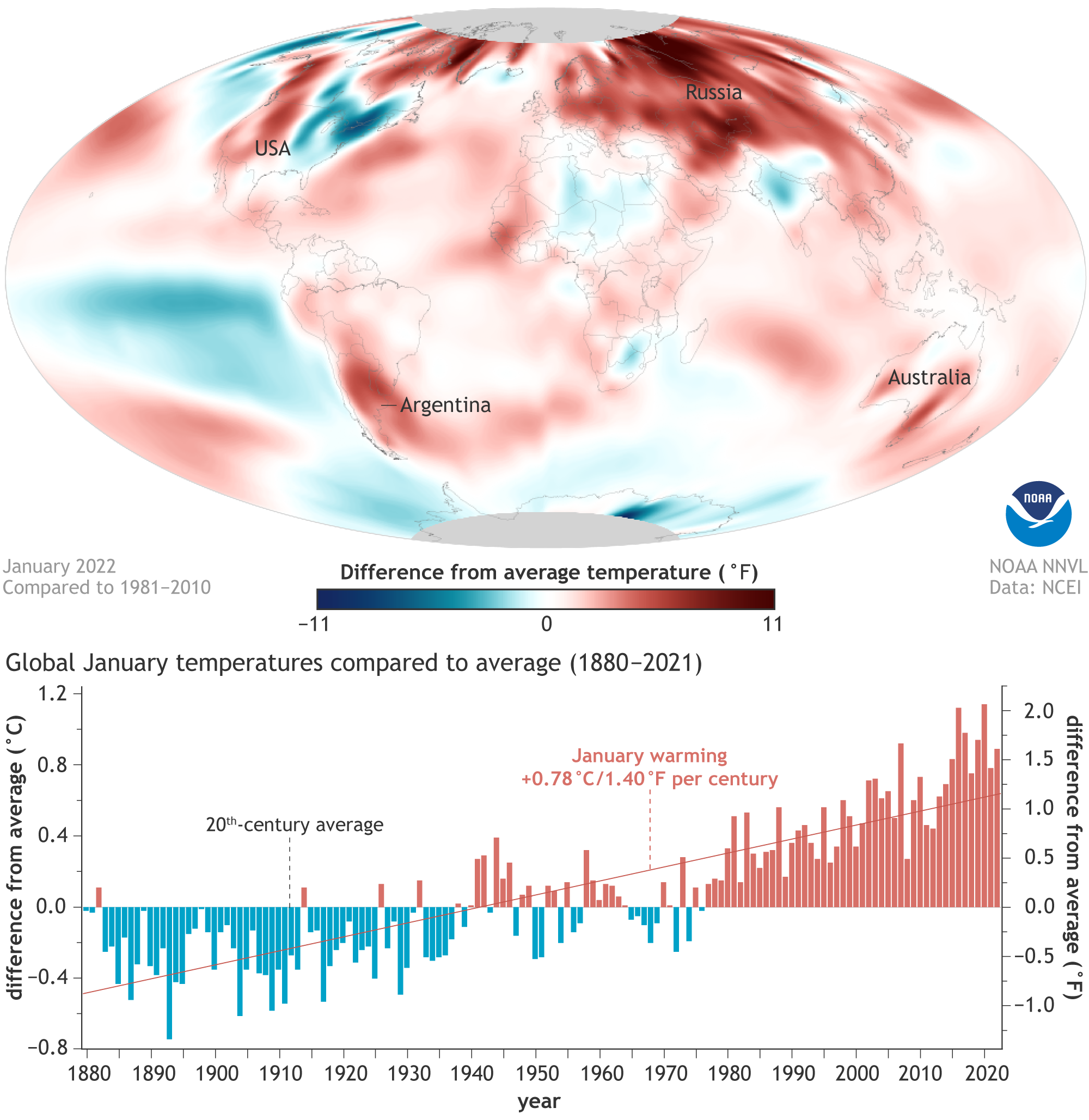
Image caption
January 2022’s surface temperature compared to the 1981-2010 average. (NOAA’s official map shows January 2022 compared to the 1991-2020 average). Places that were warmer than average are red, including virtually all of western North America, South America, Asia, and Australia. Places that were cooler than average are blue, including India, north-central Africa, and northeastern North America. Map by NOAA Climate.gov, based on data from NOAA NCEI.