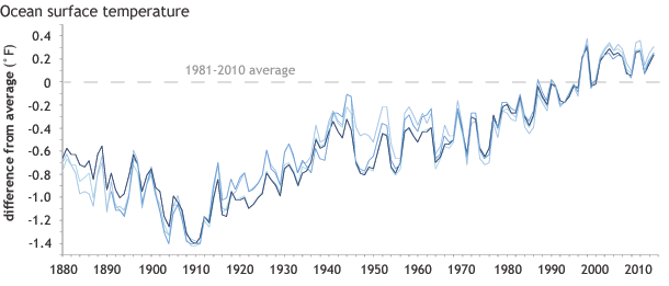
Image caption
Annual sea surface temperature compared to the 1981-2010 average from a variety of sources. Despite year to year variability, all the years in the past decade have been warmer than average. Adapted from from Figure 2.1 of State of the Climate in 2013.