
Image caption
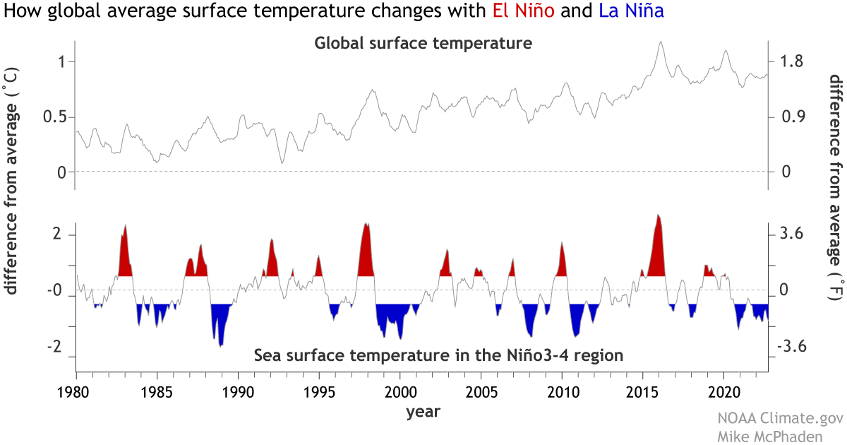
(top) Monthly average global surface temperature compared to the 20th-century average. (bottom) Monthly sea surface temperature in the Niño3.4 region of the tropical Pacific—the key ENSO-monitoring region—compared to the 20th-century average, with El Niño periods colored red and La Niña periods colored blue. The peaks and valleys of each line tend to line up, showing how global temperature tends to rise with El Niño and fall with La Niña following a short lag. NOAA Climate.gov image, adapted from original by Mike McPhaden.