
Image caption
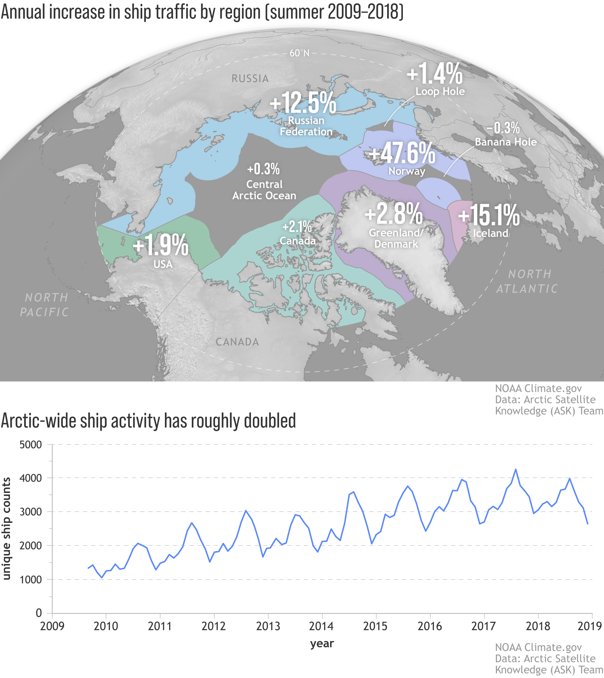
(map) Annual percent increase in summer ship activity in the Arctic. Bold numbers indicate where trends were statistically significant. The biggest increases have occurred in the waters of Norway and Iceland. (graph) Monthly unique ship counts Arctic-wide show that activity is increasing overall. Read the full story. Image by NOAA Climate.gov, based on data from the Arctic Satellite Knowledge Team.