
Image caption
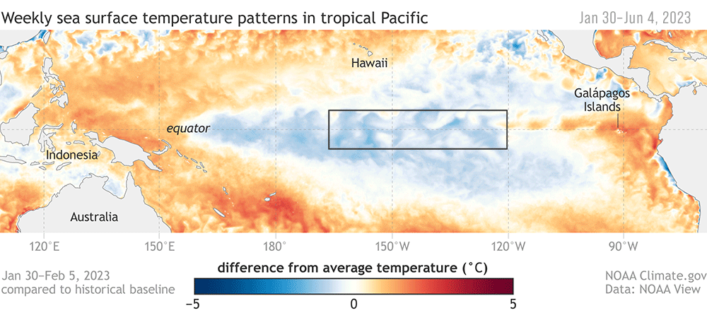
Animation of maps of sea surface temperatures in the Pacific Ocean compared to the long-term average over five-day periods from the end of January to early June 2023. The waters in the key monitoring region, which scientists call "the Niño-3.4 region," start out cooler than average (blue) and progressively become warmer than average (red) as La Niña ends and El Niño arrives. A higher-resolution version of this animation is available as a movie. NOAA Climate.gov, based on Coral Reef Watch maps available from NOAA View.