
Image caption
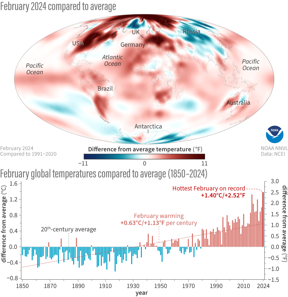
(map) Temperatures in February 2024 compared to the 1991-2020 average. Places that were warmer than average are red; places that were cooler than average are blue. (graph) Global temperature each February compared to the 20th-century average from 1850-2024. Warmer-than-average years are red; cooler-than-average years are blue. Image by NOAA Climate.gov, based on data from NOAA National Centers for Environmental Information.