
Image caption
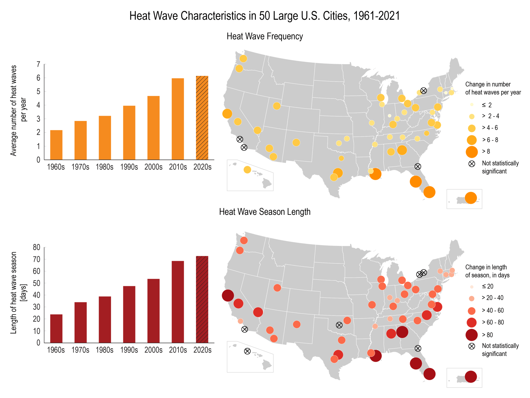
These bar graphs and maps show changes in the number of heat waves per year (frequency) and the number of days between the first and last heat wave of the year (season length). These data were analyzed from 1961 to 2021 for 50 large U.S. metropolitan areas. The graphs show averages across all 50 metropolitan areas by decade. The size/color of each circle in the maps indicates the rate of change per decade for each city. Hatching represents cities where the trend is not statistically significant. Graphic by U.S. Global Change Research Program and Environmental Protection Agency.