
Image caption
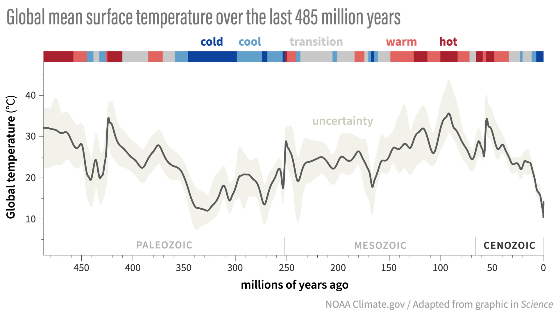
A reconstruction ("PhanDA") of global average surface temperature (gray line) over the past 485 million years. The color-coded bar across the top shows cooler (blue) versus warmer (red) climates, with darker colors indicating greater hot or cold extremes. In general, polar ice sheets likely existed during blue-coded periods. The shading around the temperature line indicates temperature likelihood. The data ends with the average temperature over the Holocene, which spans the past 11,700 years. (Although this period includes modern global warming, its impact on the multi-millennial temperature estimate is minimal.) Past temperatures were estimated by combining geological data with climate model simulations. NOAA Climate.gov animation adapted from original figure in Judd, E. J., Tierney, J. E., Lunt, D. J., Montañez, I. P., Huber, B. T., Wing, S. L., & Valdes, P. J. (2024). A 485-million-year history of Earth’s surface temperature. Science, 385(6715), eadk3705. https://doi.org/10.1126/science.adk3705