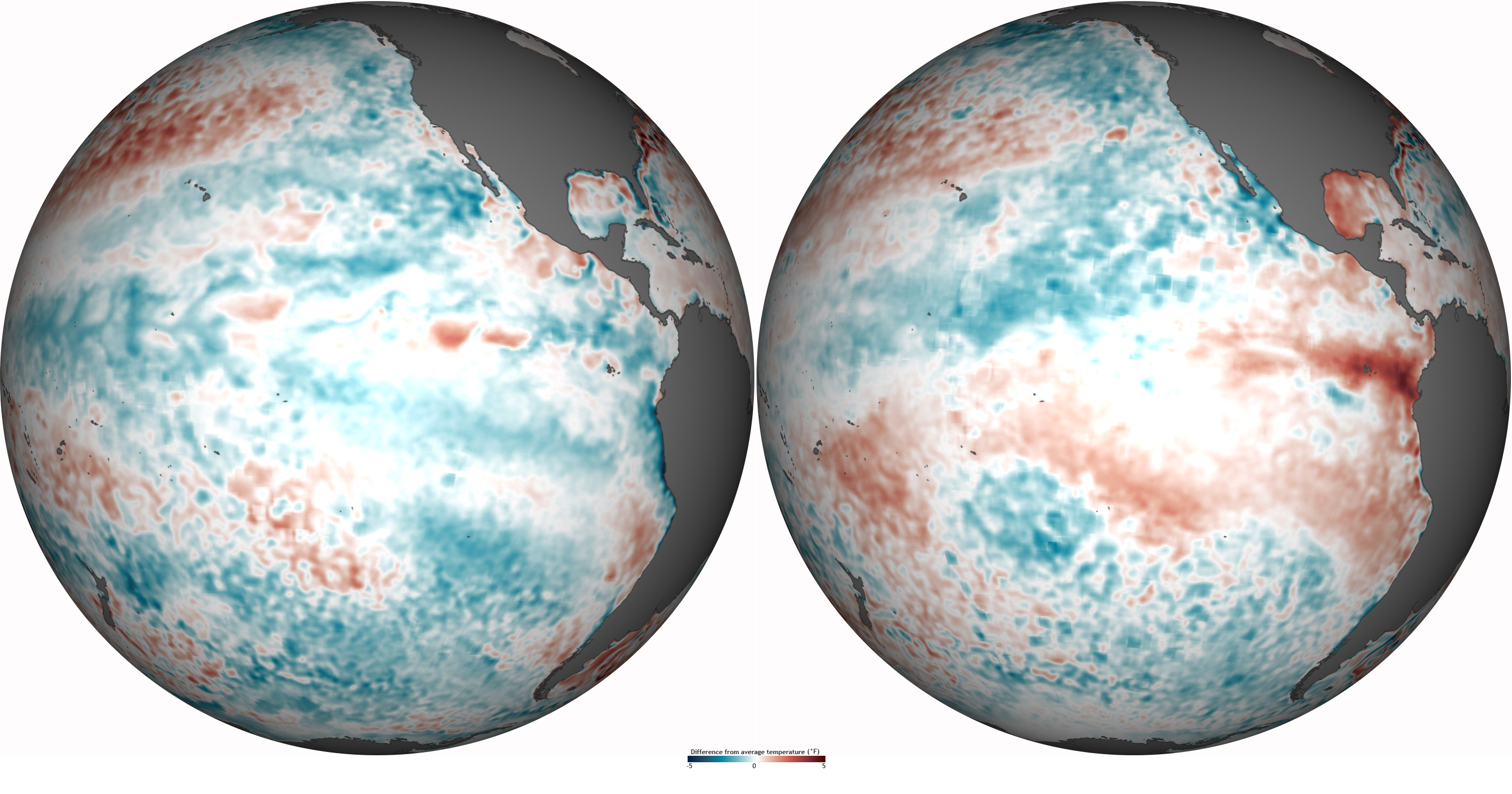
Image caption
Maps of difference from average (1981-2010) temperature across the Pacific Ocean on January 12 (left) and April 15 (right), 2012. Blues are cooler than average, while reds are warmer than average. Based on sea surface temperature anomaly data provided by the Physical Sciences Division of NOAA’s Earth System Research Laboratory.