
Image caption
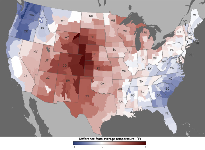
The map shows where in the United States June 2012 temperatures were different from the 1981–2010 average. Shades of red indicate temperatures up to 8° Fahrenheit warmer than average, and shades of blue indicate temperatures up to 5° Fahrenheit cooler than average—the darker the color, the larger the temperature difference.