
Image caption
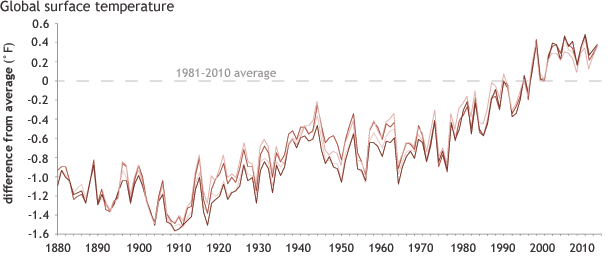
Multiple long-term records of Earth’s average temperature (different colored lines) since the late nineteenth century show a similar pattern: year to year variability combined with a long-term warming trend. The lines shows how far above or below the 1981–2010 average (dashed line at zero) the combined land and ocean temperature has been each year since 1880. Graph adapted from Figure 2.1, in BAMS State of the Climate in 2013.