
Image caption
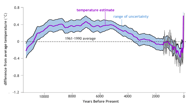
Global temperature anomalies over the past 11,300 years compared to historic average (1961-1990). The purple line shows the annual anomaly, and the light blue band shows the statistical uncertainty (one standard deviation). The gray line shows temperature from a separate analysis spanning the past 1,500 years. Image adapted from Figure 1(b) in Marcott et al.