
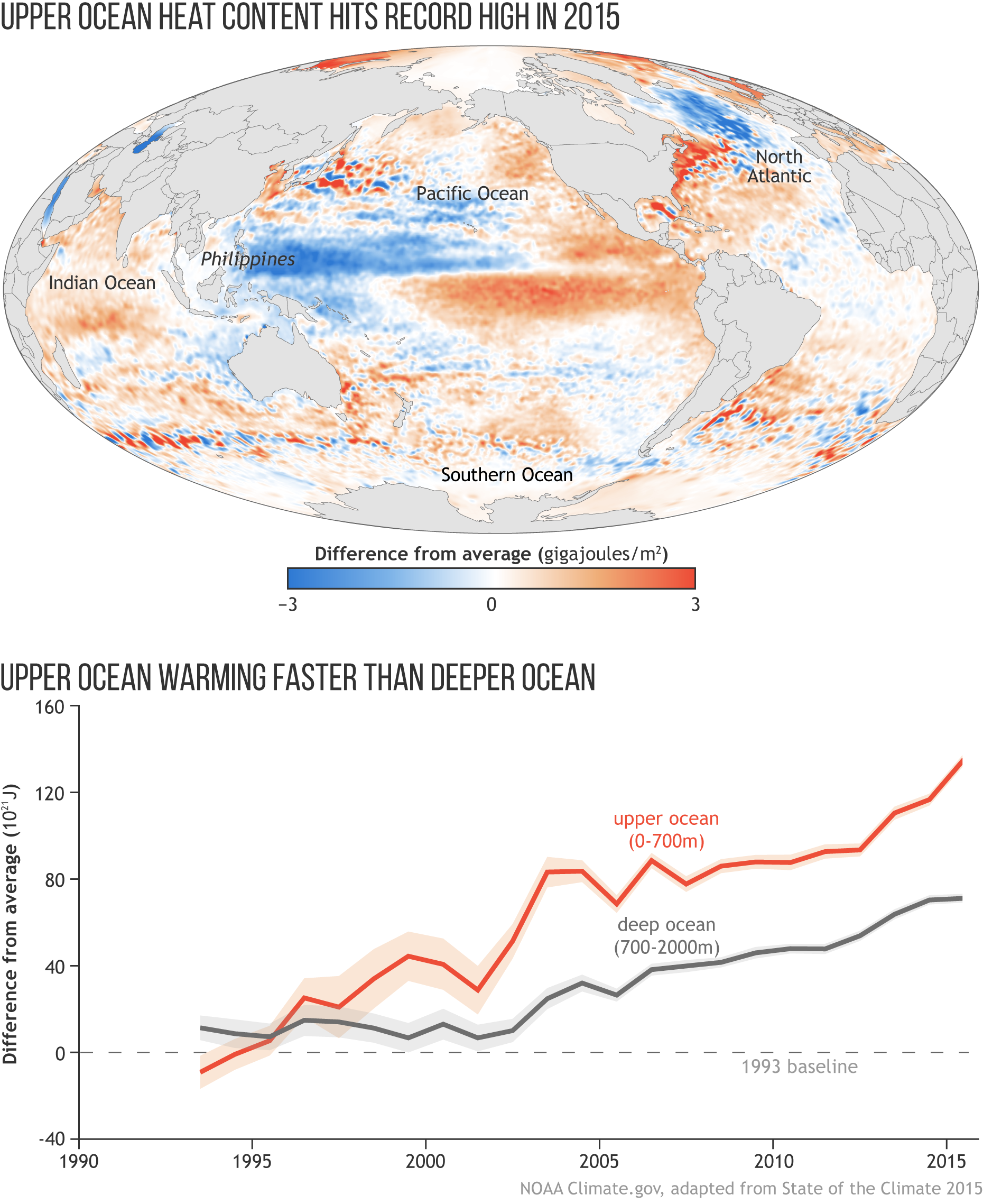
Image caption
Heat energy in the top 2,300 feet (700 meters, or slightly less than half a mile) of the ocean in 2015 relative to a 1993–2015 average. Areas in blue show ocean where stored heat was below average, while areas in orange and red show where ocean heat content was above average. The graph beneath the map shows heat content in the upper 2,300 feet (700 meters) of the ocean (orange) and the deeper ocean (2,300–6,500 feet, gray) relative to a 1993 baseline. Full story.