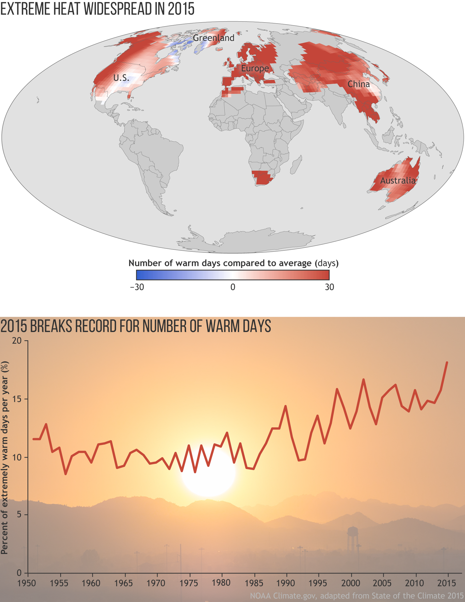
Image caption
The map shows the frequency of warm days in 2015 compared to the long-term (1961-1990) average. For this analysis, days with temperatures warmer than 90 percent of the 1961-1990 seasonal record are considered “extremely warm days.” The graph shows the percent of days each year that were extremely warm. The year 2015 broke the record for the highest number of extremely warm days in the 66-year record (1.8 times more than the average number according to one dataset). Full story.