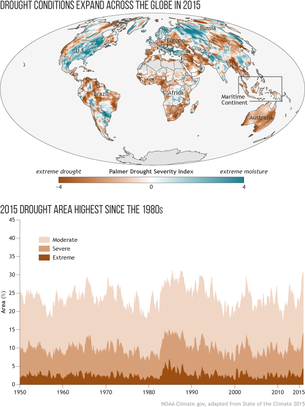
Image caption
The map shows the areas that experienced drought conditions in 2015. The darker the brown, the more extreme the drought. The graph shows the percentage of global land area (excluding ice sheets and deserts) in a moderate, severe, or extreme drought. By the end of 2015*, 30% of the global land was in drought, with 14% in a severe or extreme drought, the two most dire categories.