
Image caption
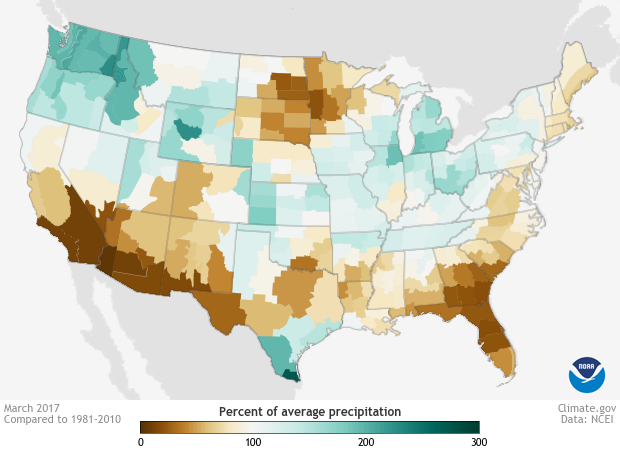
This map shows the percent of average precipitation for March 2017, compared to the 1981–2010 average, for the contiguous United States. The lowest amounts (approaching 0%) appear in shades of brown, and the highest amounts (approaching 300%) appear in shades of blue-green. Image by Climate.gov using data from NCEI.