
Image caption
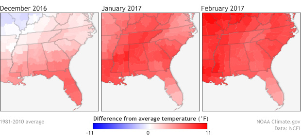
These maps show temperature anomalies for the southeastern United States, from December 2016 (left) through February 2017 (right). Temperatures above the 1981–2010 average are red, and temperatures below the 1981–2010 average are blue. Image by Climate.gov using data from NCEI.