
Image caption
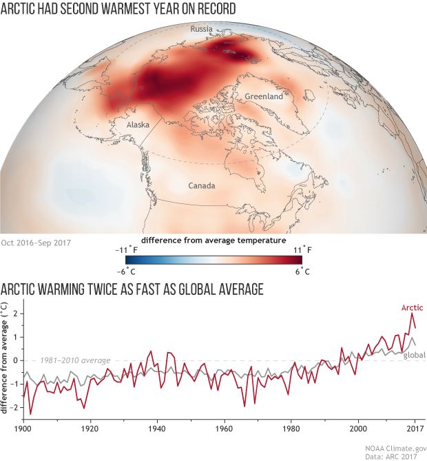
In the Arctic map, areas with above-average temperatures are red, and areas with below-average temperatures are blue. The time-series graph shows greater positive anomalies in the Arctic than across the globe.
In the Arctic map, areas with above-average temperatures are red, and areas with below-average temperatures are blue. The time-series graph shows greater positive anomalies in the Arctic than across the globe.