Image caption
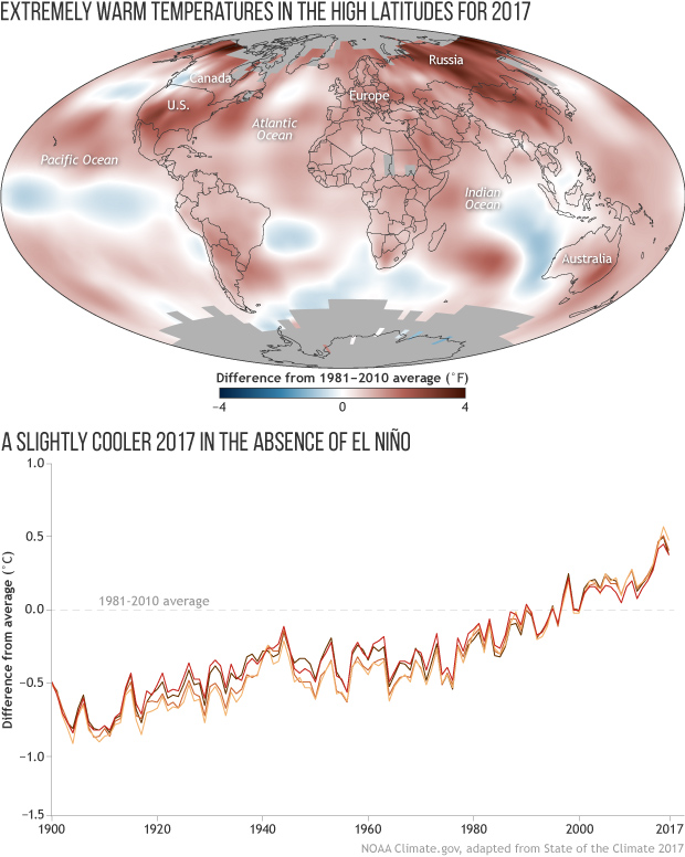
Global map of where surface temperature in 2017 were warmer (red) or cooler (blue) than the 1981–2010 average. Below the map, the graph shows annual temperatures from 1900–2017 from multiple data sets. Climate.gov graph adapted from Figure 2.1a in State of the Climate in 2017.