Bringing together 400+ experts to give Earth its annual climate checkup
The State of the Climate is a rather huge report―in the neighborhood of 270 pages―that updates the status of major climate variables and recaps regional climate conditions around the world every year. The report just celebrated its silver anniversary: 25 years of annual publications. The first report was written by 29 scientists from 3 countries: the United States, the United Kingdom, and the former Soviet Union. Impressively, six of those scientists just celebrated their 25th anniversary of working on this report. This year, more than 400 authors and editors from 58 countries joined those original six to help bring together the State of the Climate in 2014.
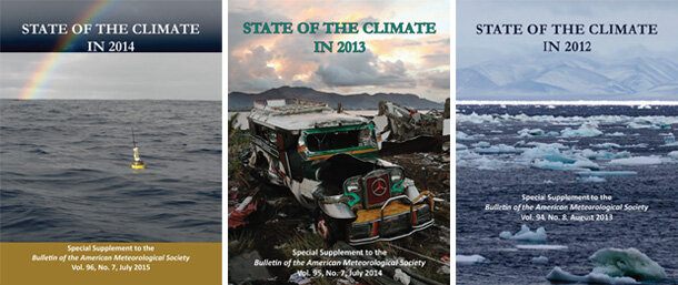
Covers for the three most recent BAMS "State of the Climate" reports. NCEI scientist Jessica Blunden has been serving as the report's lead editor since 2010.
We release each year’s report in the summer of the following year. A lot of people ask: what's so new about this report if you're just reporting on what happened last year, six or seven months after the fact, and a lot of the information has already been published anyway? That’s a fair question. Since Deke Arndt―my colleague and one of the main contributors to this blog―took on the role of report editor in 2009, and I joined him in 2010, we have learned a lot of about the challenges and the value of putting together the State of the Climate report every year.
No Easy Feat
You may wonder what is so enjoyable about putting together a massive almanac of climate information under super tight deadlines, but that is exactly what is enjoyable about it: it’s an exciting challenge. With hundreds of authors, editors, and reviewers located all around the world, not once have we missed our deadline for finishing the report. This is a reflection of the level of dedication these people have in getting the best science and the best information possible to the public.
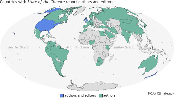
More than 400 international authors and editors contributed to the 2014 "State of the Climate" report.
The scientists who work on the State of the Climate report are among the leading experts in their field or country. They care enough to spend their time, often year after year, updating the state of "their" region or "their" indicator. This report also undergoes intensive reviews, and the reviewers provide thorough and thoughtful comments and suggestions under tight deadlines.
Aside from the coordination challenges, there’s the fact that it is not always easy to report on climate; there are different challenges for each indicator and region. We receive a lot of information from individual national meteorological services, but there are limitations in some areas, maybe because the resources to build and maintain an observing network simply are not there, or because there may be turmoil or instability.
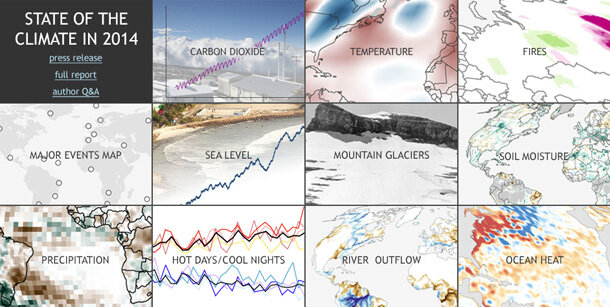
Highlights for key climate indicators and major regional climate events for 2014.
When I first started working on the report in 2010, for example, we received climate information for Iraq based on observations and analyses from military personnel stationed there. Since allied troops left, the country has not yet been able to support the kind of observations we need for this type of report and analysis, and so we are currently unable to report on the region. We are always thrilled to add more countries as they are able.
Sometimes there are other limitations. There may be gaps in data collection when a satellite fails or has run its course before another can be launched. In 2012, the demise of the ENVISAT satellite prevented us from reporting on lake temperatures. We are still unable to report on this indicator today. In some areas, it is just physically difficult to collect data.
On the flip side, as technology advances, more robust, reliable datasets are being created that improve our analyses and, therefore, our knowledge. This is true, for example, in Antarctica and in the deep oceans, where we are learning more about how conditions are changing. Just a decade ago, what we could report on the conditions in Antarctica were described in just a couple of pages. Today, eight different aspects of the continent’s rather harsh climate are examined in much greater detail, including a new section we just added this year on the state of the Southern Ocean.
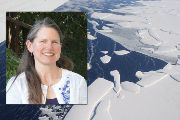
Sharon Stammerjohn, editor for Chapter 6: Antarctic in the State of the Climate in 2014 report. Background photo by Jefferson Beck, NASA Operation IceBridge.
How Climate Trends Become Clear
In my short time as editor, both natural climate variability and climate change have been documented in the State of the Climate reports. We know that weather and climate is super complex, and that there will always be some variations simply due to natural weather patterns. In the five years I’ve been editing the report, the El Niño–Southern Oscillation (ENSO) and its major impacts across different parts of the world have come full circle.
At the beginning of 2010, a warm-phase El Niño was beginning to fade, and by the middle of the year, a cool-phase La Niña was already evolving. After La Niña ended in early 2012, there was a long stretch of ENSO-neutral conditions, where neither phase was present. Then at the end of 2014 El, Niño began to emerge once again.
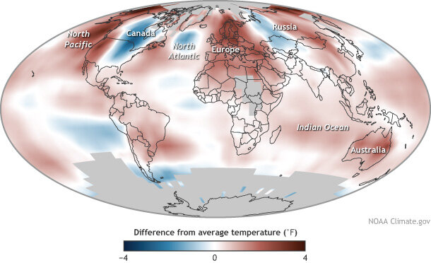
Average temperature in 2014 compared to the 1981-2010 average. Adapted from Plate 2.1c in "State of the Climate in 2014." Download editable PDF.
El Niño and La Niña have certain―and very different―known impacts on temperature and precipitation patterns across the world. So, aside from simply reaffirming that El Niños do indeed appear every few years, we’ve also documented the impact of this phenomenon and its different phases in these last five publications.
Through this report, we have also documented that greenhouse gases have continued to rise to new record levels each year as the trends of important climate indicators like air and sea surface temperatures and sea level continue to rise, while others like melting glaciers and ice sheets continue to decline.
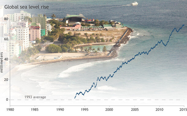
Global sea level each year since 1993 compared to the 1993* average (dashed line). Graph adapted from Plate 1.1x in State of the Climate in 2014. *Update: 7/16, 2:05 p.m. A previous version of this graph incorrectly labelled and identified the baseline as the 1993-2010 average.
The state of many of these indicators can and will have very real impacts on people and ecosystems around the world in countless ways. Every time we collect another measurement or add another point on the graph, our knowledge of what is happening over time becomes a little bit better and a little bit clearer.
No matter what happens, as scientists, we have an obligation to report this information the best way we know how. I think one of the best ways is by bringing it together in this report each year, adding to the information we already have, and sharing it with you. I hope before I hit my own silver anniversary, the report will show we’re on a new path, one where the rate of greenhouse gas emissions and resulting climate change has declined or reverse