Is Second Place Really 'First Loser'?
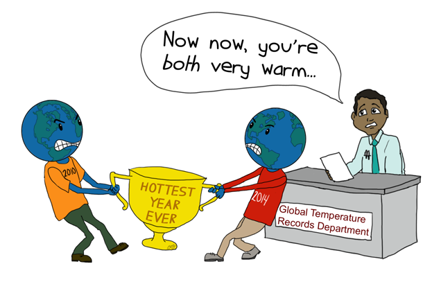
NOAA Climate.gov cartoon by Emily Greenhalgh.
Two weeks ago, I wrote about 2015’s chances of dethroning 2014 as the warmest year on record and how the maturing El Niño increases those odds.
This week, going Beyond the Data, we’ll unpack what that first-place ranking really means. In the big picture, the actual rank of an individual year isn’t that important. In fact, using ranks can really over-emphasize their importance. So why do we use them?
The Power of Context
Let’s start with something light, like some [really amateur] comparative psychology. As animals, we use real-time information to identify threats. This keeps us (and bears) from walking into fires. As humans, we seek patterns. It’s what we do. We thrive by recognizing trends and relationships between vastly separate streams of data.
A bear can identify a blueberry bush; a human can also identify the bush, but additionally knows that watering it when needed will increase the yield. Recent rainfall and the amount typically needed by blueberry bushes become companion pieces of information important to our blueberry outlook and related actions. This ability to combine information in predictive ways is one reason we have nice things, while bears live in caves.
Put another way, we seek context when we process new information. Context is often more important to learning than the information itself.
In weather, we often use context to define the magnitude of a threat. The Saffir-Simpson scale categorizes tropical storms (it’s not just Hurricane Ike, but Category 4 Hurricane Ike). Tornadoes get the Fujita scale. We define thresholds for gale conditions or severe thunderstorms. This helps us understand the magnitude of these threats.
Climate, in a way of thinking, is weather times time. This means time takes on much more meaning in how we assess climate. Subtle climate changes and variations don’t trigger our real-time animal-threat instincts, but they do strongly impact our well-being, personal and shared.
Instead of contextualizing the magnitude of a threat, climate monitoring deals in time—in historical context. How does this event that we just experienced fit with what we know about the past, or what we expect in the future? What are the patterns? What are the relationships?
The Beauty of Ranks
This is where ranks shine. “Second warmest out of 121 on record” immediately and intuitively places a year (or month, or season) into historical context, providing a shortcut answer to the question “how unusual was it?”
For example, both of the following statements are true for the 14.06 inches of rain, on average, that fell across my native state of Oklahoma during May 2015:
- It was Oklahoma’s wettest of 121 Mays on record, and wettest of 1,445 months on record, since 1895.
- It was 9.22” above the long-term average, and, after transforming from a gamma to a Gaussian distribution, it was 3.3 standard deviations above the median May value.
Which of these is easier for you to work with? If you’re running a sophisticated agricultural, economic or hydrologic model, maybe the second example is for you. But for most folks, the first statement contextualizes the unusualness just fine, without all of the mental gymnastics demanded by the second.
The Folly of Ranks
Using ranks has a considerable downside. For starters, in order to rank things, we sometimes end up splitting hairs, stripping away precious context, implying a distinction that isn’t really meaningful. Think of a ten-horse race with a clear winner, a clear second place finisher, seven horses that cross in a tight grouping, and a straggler that finished a distant tenth.
Now consider the ninth place horse, which ran almost as fast as the third place finisher. Since ninth and tenth place seem closer than third and ninth, looking only at ranks would imply that she ran more like the last-place horse.
This distinction without much difference is especially important when measurement uncertainty is a factor. Using ranks without additional context can over-emphasize small differences between individual years. Those tight groupings can be statistically indistinguishable, meaning that they can be technically separated based upon their measured values, but not beyond a reasonable doubt.
Ranks can feed into the wonderfully American, but ultimately simple viewpoint that second place is first loser; if you ain’t winning, you’re losing; in other words, that second warmest is “not warm.” Ask anybody who knows football: they’ll tell you the Buffalo Bills were the best team in the NFL in the early 1990s. But the peanut gallery says “Never won a Super Bowl.”
I think 2015 is going to be the warmest year on record. There, I said it. It will be an interesting note to help us put 2015 in context, to sort out where she stands among the 135 other years since 1880. But the ranking won’t mean much to our understanding of long-term climate change; just finishing among the warmest years further confirms what we've known for years. What’s really important:
2015 will be another very warm year among a run of very warm years, reinforcing the warming trend we see in the data and underscoring our understanding of climate change.
To get the big climate picture, look at the forest, not the trees. Pitting individual years against each other is pretty useless in assessing long-term change. But grouping them into decadal averages, like the chart below, is very useful.
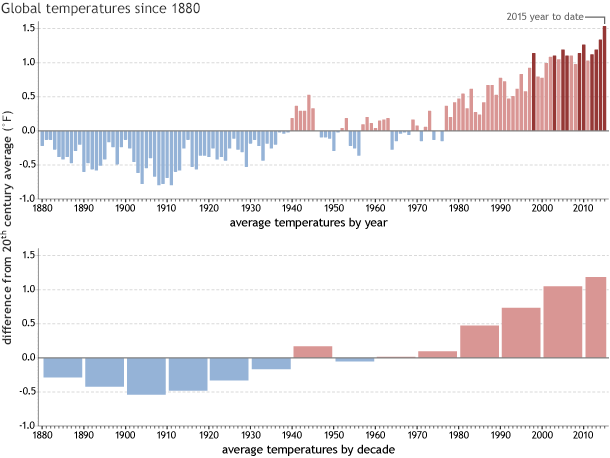
(top) Global temperatures each year since 1880 compared to the twentieth-century average, with the ten warmest years on record in dark red. (bottom) Decadal averages of difference from average temperature, with the final column showing the decade to date. NOAA Climate.gov graph, based on NOAAGlobalTemp data provided by the National Centers for Environmental Information.
The warmest year (2014) is only 0.07 degrees warmer than the second-warmest year (2010), and only 0.14 degrees warmer than the third-warmest years (2005 and 2013). Meanwhile, the warmest complete decade (2000-09) is 0.32 degrees warmer than the second-warmest decade (1990-99), and 0.58 degrees warmer than the third-warmest (1980-89). The current (incomplete) decade rises above the previous one by an impressive margin, even before 2015’s warmth is factored in.
More importantly, swapping 2010 and 2014 would make no difference in this decadal assessment, and swapping 2005 and 2014 would only make a negligible difference. The big picture holds true, regardless of which year is warmest. 2010 may be the Buffalo Bills of global temperature years, but it is very important to anchoring what is very likely to become the new warmest decade on record.
The Inevitability of Ranks
Ranks aren’t perfect. But there aren’t many alternatives to their capacity to simply and intuitively build historical context. That’s why we’ll keep using them in simple assessments. And in our longer-form assessments, we’ll always include more rigorous information, like long-term averages, estimates of uncertainty, and of course, links to the entire dataset.
So, on the day we announced that May 2015 was the warmest of 136 Mays on record, you know just how meaningful and meaningless that is, and you’ve gone Beyond the Data.