Climate Conditions: March 2013 Difference from Average Temperature
Details
In Brief
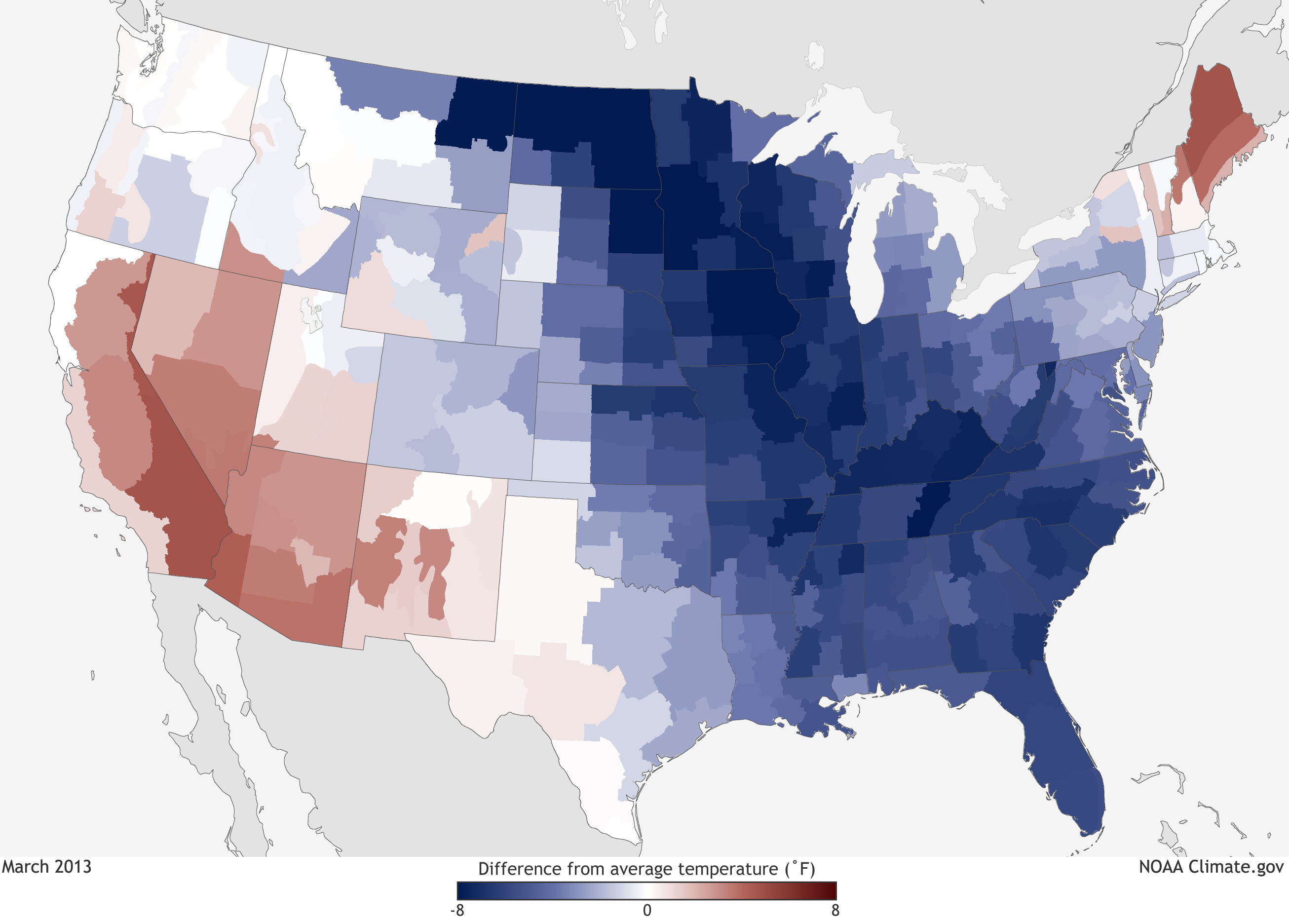
This map shows where temperatures in March 2013 were warmer or cooler than the long-term average temperature from 1981-2010. Shades of red indicate where temperatures were warmer than average; shades of blue show where it was cooler than average. The darker the color, the larger the difference from average.
During March 2013, most of the eastern United States was notably cooler than average, with the exception of New England. Along the Rockies, temperatures were closer to normal. Areas of the Southwest experienced above-average temperatures. Overall, the average temperature for the contiguous United States was 40.8° Fahrenheit, nearly 1° Fahrenheit below the twentieth-century average.
More info
Difference-from-average temperature maps are also known as temperature anomaly maps: they answer the question, "Was it warmer or cooler than usual?" In this case, "usual" means the long-term average temperature for the month of March, measured at stations across each of the 344 climate divisions of the contiguous United States from 1981 to 2010.
Temperature records used to generate the map come from automated and volunteer-operated weather stations in each climate division. The departure-from-average values are calculated by averaging daily high and low temperatures reported for each climate division through the month, and subtracting this result from the division's long-term average monthly temperature. In places where temperatures were warmer than the long-term average, the result is positive, and the map shows the division in a shade of red. Places where temperatures were cooler than the long-term average yield a negative result, and are shown in shades of blue. The larger the anomaly, whether warm or cold, the more vivid the color. Climate divisions where temperatures observed through the month averaged out to a value near their long-term average temperature are white or nearly white.
These climate statistics and many others are part of NOAA’s National Monthly Climate Report. The National Climatic Data Center produces these reports as part of the suite of climate services that NOAA provides government, business, and community leaders to help them make informed decisions.
Technical Details
This map is based on U.S. Climate Division data from the National Climatic Data Center.
- Data access
- More details on calculating monthly averages
- National map of climate divisions
- Climate divisions by state
