'Climate stripes' graphics show U.S. trends by state and county
In 2018, British climate scientist Ed Hawkins created. collection of graphics that have become known as “Climate Stripes.” These bar-code-like images turn a location’s annual climate data into a row of colored stripes. Each stripe shows one year's temperature or precipitation compared to the long-term average—red bars for warm years, and blue for cool ones; green for wet years, and brown for dry ones. The darker the color, the bigger the difference from average.
Inspired by Hawkins’ images, our Climate Stripes collection is based on the NOAA climate record for U.S. states; counties; Washington, D.C.; and selected stations in Hawaii. Access the collection through the interactive embedded below. Map features work best when you view in a new window.
National stripes
Below are the climate stripes for the contiguous United States. (Alaska and Hawaii aren't included because their climate records do not go as far back in time as the "Lower 48" states.) According to NOAA National Centers for Environmental Information, the annual average temperature of the United States has warmed at a rate of 0.16 degrees Fahrenheit per decade between 1895 and 2023. The darkest red bar that appears near the right side of the temperature image is the current warmest year on record for the country—2012, when the annual average temperature was 55.28 degrees Fahrenheit, 3.26 degrees warmer than the 20th-century average of 52.02 degrees Fahrenheit.
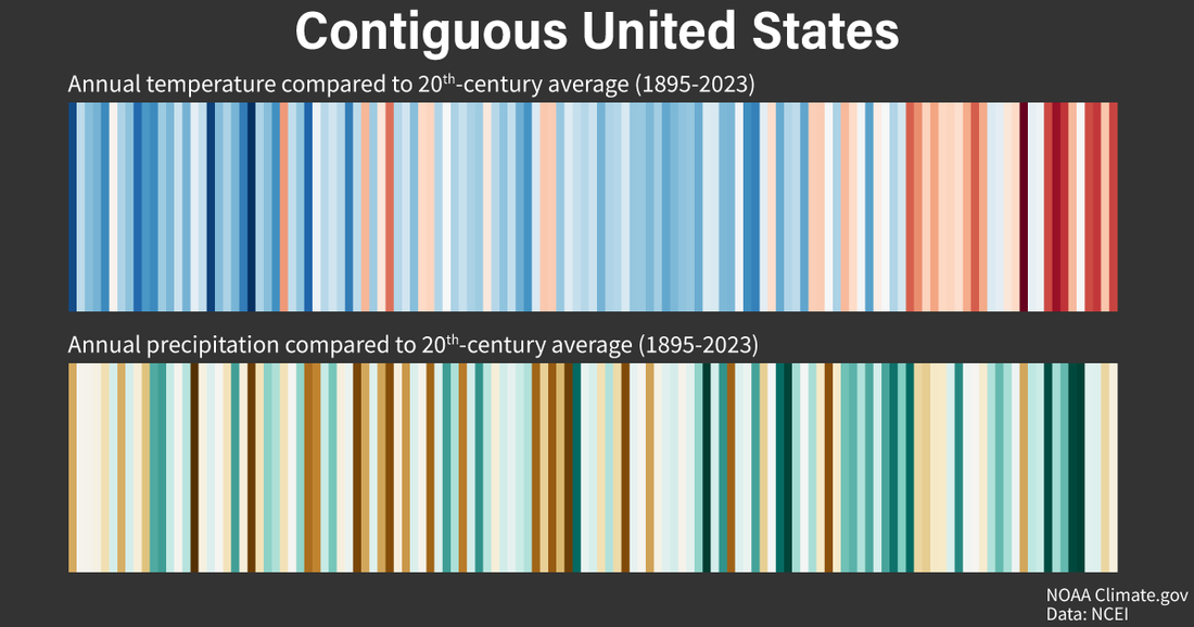
Annual temperature (top) and precipitation (bottom) in the contiguous United States from 1895-2023 arranged from left to right. Each line shows a given year's temperature or precipitation compared to the 20th-century average. The darker the red or blue, the warmer or cooler the year. The darker the green or brown, the wetter or drier the year. Red bars dominate the right end of the temperature image, showing the influence of human-caused global warming on U.S. average temperature. The precipitation stripes image also shows a pattern of more green than brown in recent decades. Although there is a lot of variability from place to place, the U.S. average precipitation is increasing. NOAA Climate.gov images, based on data from NOAA National Centers for Environmental Information and analysis by Jared Rennie.
- Explore the U.S. historical climate record in detail with NOAA National Centers for Environmental Information's Climate at a Glance tool.
- See maps of national trends.