2014 State of the Climate: Temperature Extremes
Why temperature extremes matter
Trends in global average surface temperature reveal the overall impact on climate of rising concentrations of greenhouse gases. But people, plants, and animals don’t experience the global average temperature. We experience temperature locally, and through daily temperature extremes. In this way, changes in the frequency of very hot days or cool nights is a more meaningful indicator of how people, agriculture, and natural ecosystems are feeling the effects of climate change.
Very warm days can pose human health risks, especially in places that lack air conditioning; can stunt crops or interrupt key growth stages; and can stress livestock and other animals, including commercially and recreationally valuable fish in rivers and streams. Cool nights also have important impacts. For example, extremely cold winter nights play a role in controlling pests such as pine beetles out West and the hemlock adelgid in the East.
Conditions in 2014
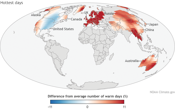
Frequency of hottest days in 2014 compared to the 1961-1990 average. Adapted from Plate 2.1e and d in State of the Climate in 2014. Download editable PDFs here.
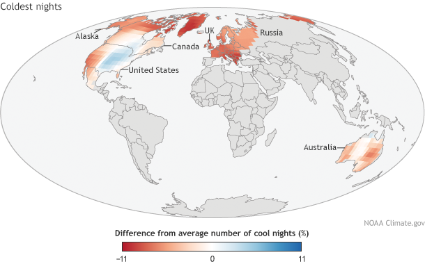
Frequency of coldest nights in 2014 compared to the 1961-1990 average. Adapted from Plate 2.1e and d in State of the Climate in 2014. Download editable PDFs here.
Adapted from the 2014 BAMS State of the Climate report, these maps show the frequency of warm days and cool nights in 2014 compared to the long-term average. Meteorologists examined the range of daytime high and nighttime low temperatures during 1961-1990 and divided it into brackets, or percentiles. Days with high temperatures warmer than 90 percent of the 1961–1990 record are considered warm days. Nights with low temperatures in the bottom 10 percent of the temperature record are considered cool nights.
The warm days map shows places where the frequency of warm days was higher than the 1961-1990 average in shades of red and places where the frequency of warm days was below the long-term average in blue. The cool nights map uses the opposite color convention: places where the frequency of cool nights was below-average are colored with “warm” colors (red, orange), and places where the frequency of cool nights was above average are colored in shades of blue.
In terms of both warm days and cool nights, cool conditions prevailed across large parts of the North America, especially the eastern half of the continent. Across much of the rest of the globe, though, 2014 conditions were unusually warm compared to 1961–1990.
Change over time
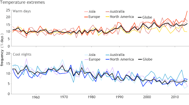
Frequency of days with temperatures in the warmest (top) or coolest (bottom) 10% of the historical record for the globe (black lines) and for individual continents. Graph adapted from Figure 2.6 a and b in State of the Climate in 2014.
The graph shows warm days and cool nights, relative to the 1961–1990 record, from 1950 through 2014. Although temperatures diverge among continents from year to year, the overall global trend is clear: the number of warm days has increased while the number of cool nights has decreased.
Reference
Dunn, R.J.H., M.G. Donat, and T.C. Peterson, 2015: [Global Climate] Temperature Extreme Indices [in “State of the Climate in 2014”]. Bulletin of the American Meteorological Society (BAMS), 96 (7), S15-S16.