Climate change and the 1991-2020 U.S. Climate Normals
As soon as the 2021 New Year’s celebrations were over, the calls and questions started coming in from weather watchers: When will NOAA release the new U.S. Climate Normals? The Normals are 30-year averages of key climate observations made at weather stations and corrected for bad or missing values and station changes over time. From the daily weather report to seasonal forecasts, the Normals are the basis for judging how temperature, rainfall, and other climate conditions compare to what’s normal for a given location in today’s climate.
For the past decade, the Normals have been based on weather observations from 1981 to 2010. In early May, climate experts at NOAA’s National Centers for Environmental Information will be releasing an updated collection—hourly, daily, monthly, and annual Normals for thousands of U.S. locations, states, regions—based on the weather experienced from 1991 to 2020.
But what about global warming?
Alongside the questions about when the new Normals will be released (first week of May), we’ve gotten a lot of questions about the Normals and global warming. Is global warming affecting the Normals? (Yes). Are the Normals adjusted to “subtract out” global warming? (No.) So the new normal reflects our changing climate? (Yes). Then how do we keep track of what used to be normal? (Different analyses.)
The last update of the Normals took place in 2011, when the baseline shifted from 1971-2000 to 1981-2010. Among the highlights of the rollout was the creation of a map showing how climate-related planting zones across the contiguous United States had shifted northward in latitude and upward in elevation. It was a clear signal that normal overnight low temperatures across the country were warmer than they used to be.
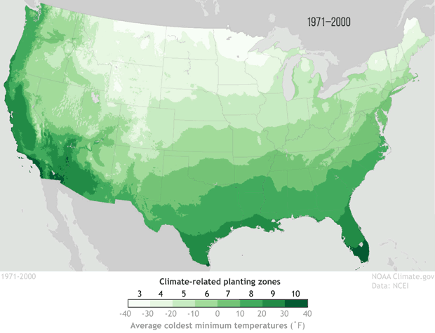
Changes in U.S. climate-related planting zones between the 1971-2000 Normals and the 1981-2010 Normals. Many places' coldest temperatures of the year grew warmer between the two periods, leading to a shift in plant hardiness zones. NOAA Climate.gov, based on data from NCEI. Explore an interactive map.
The planting zone maps emphasized a key point about the Normals and climate change: the once-per-decade update means these products gradually come to reflect the “new normal” of climate change caused by global warming. What’s normal today is often very different than what was normal 50 or 100 years ago. This gradual adjustment is the point: the purpose of the Normals is to provide context on what climate is like today, not how it’s changing over time.
A warmer normal
The U.S. Climate Normals collection has 10 versions: 1901-1930, 1911-1940, and so on through 1991-2020. In the image below, we’ve compared the U.S. annual average temperature during each Normals period to the 20th-century average (1901-2000). Places where the annual temperature during a given Normals era was colder than the 20th-century average are blue; places where the temperature was warmer than average are red.
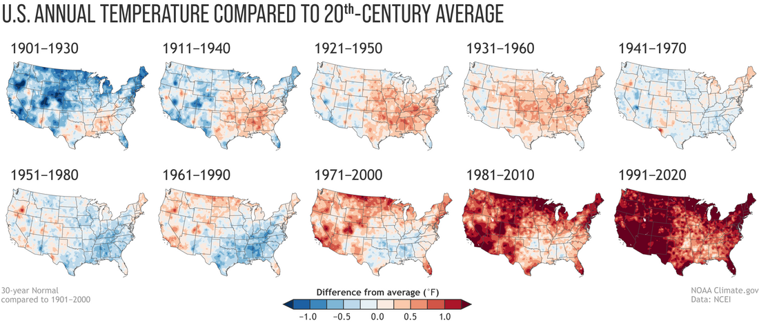
Annual U.S. temperature compared to the 20th-century average for each U.S. Climate Normals period from 1901-1930 (upper left) to 1991-2020 (lower right). Places where the normal annual temperature was 1.25 degrees or more colder than the 20th-century average are darkest blue; places where normal annual temperature was 1.25 degrees or more warmer than the 20th-century average are darkest red. Maps by NOAA Climate.gov, based on analysis by Jared Rennie, North Carolina Institute for Climate Studies/NCEI.
The influence of long-term global warming is obvious: the earliest map in the series has the most widespread and darkest blues, and the most recent map has the most widespread and darkest reds. Today, the normal annual temperatures across the country are warmer than the 20th-century average virtually everywhere. From 1901-1930, the annual average temperature was mostly colder than the 20th-century average.
What’s also obvious in these comparisons is that the influence of global warming on normal U.S. temperature isn’t the same everywhere or during every 30-year period on record. Otherwise, the maps would have transitioned gradually from dark blue everywhere to dark red everywhere. In fact, a few locations do exhibit that pattern of gradual, steady warming from one Normals era to the next. Southeastern Oregon. Southern Florida. You can probably spot others.
But in many places, the pace of warming changes from decade to decade due to other climate influences, both natural and human (think the Dust Bowl and smokestack pollution before the Clean Air Act). For example, in much of the U.S. Gulf Coast region, the maps show that normal annual temperatures were actually warmer than the 20th-century average in the first four sets of Normals. Beginning with the 1941-70 Normals, they reverted, with normal annual temperature growing increasingly cooler over the next two periods. That cooling pattern began to weaken with the 1971-2000 Normals, and it has all but disappeared today.
A wetter normal?
“It varies” is the main message of the maps showing how the normal annual precipitation across the country has changed. Precipitation—regardless of human-caused climate change—varies a lot from place to place across the United States. Few places exhibit a precipitation trend that is either steadily wetter or steadily drier than the 20th-century average. Instead, drier areas and wetter areas shift back and forth without an obvious pattern.
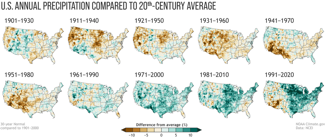
Normal annual U.S. precipitation as a percent of the 20th-century average for each U.S. Climate Normals period from 1901-1930 (upper left) to 1991-2020 (lower right). Places where the normal annual precipitation was 12.5 percent or more below the 20th-century average are darkest brown; places where normal annual precipitation was 12.5 percent or more wetter than the 20th-century average are darkest green. Maps by NOAA Climate.gov, based on analysis by Jared Rennie, North Carolina Institute for Climate Studies/NCEI.
For example, the Southwest was much wetter than the 20th-century average in the 1901-30 and 1911-40 Normals, and then mostly drier than the 20th-century average in the next four Normals. The 1961-90 Normals were a mix, with few areas either very wet or dry relative to the 20th-century average. The next two Normals periods—1971-2000 and 1981-2010— were once again much wetter than the 20th-century average across much of the Southwest, but the pattern has reversed in the new Normals.
That inconsistency isn’t surprising, despite the fact that human-caused climate change likely is influencing U.S. precipitation in some places and seasons. It’s just that what controls precipitation varies so much from place to place and month to month that the influence of global warming also varies a lot. Some parts of the country are projected to see increases in annual average precipitation, and others may see decreases. Some may see wetter winters but drier summers, with little net change in annual average precipitation—but big impacts on natural ecosystems and agriculture that depend on a certain seasonal cycle. Some will see a shift in the type or intensity of precipitation without seeing a change in their annual total. More rain, less snow. More downpours, with longer dry spells between.
With all this nuance, it’s not surprising that precipitation maps don’t show the same unmistakable fingerprint of climate change that the temperature maps do. And yet, it’s probably not a coincidence that the last four maps in the series—the 1961-1990, 1971-2000, 1981-2010, and 1991-2020 Normals—are nationally the four wettest-looking maps in the collection. At least some of that wetness relative to the 20th-century average is linked to the overall warming and “wetting” of the atmosphere that’s occurred as rising temperatures enhance evaporation of water from the ocean and land surface.
What used to be normal
The 1991-2020 Normals tell us what is normal in today’s climate. NOAA does other analyses that tell us about what used to be normal. For its monthly and annual climate monitoring, temperature averages and precipitation totals are ranked since 1895, with many states ranking towards warm extremes recently. Also, U.S. and global climate conditions are compared to the 20th-century average.
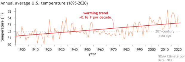
Average annual temperatures for the contiguous United States from 1895 to 2020 (orange line), along with the warming trend of 0.16˚Fahrenheit per decade (red line). Graph by NOAA Climate.gov, based on data from NCEI Climate at a Glance.
Having the entire 20th century included for comparison means the baseline captures more of the range of natural variability that’s possible in U.S. and global climate. It also provides a reasonable—but conservative—indication of the influence of long-term warming on temperatures. For the end-of-year global climate recap, NOAA also includes an additional comparison of the current year’s temperature to average temperatures from the 21-year period from 1880-1901, when the influence of global warming was still small relative to natural variability.
At the NCEI website, NOAA provides a couple other ways of understanding how U.S. climate has changed over time. They have a collection of maps showing both recent and long-term trends in temperature and precipitation. The maps are available for each month and the four seasons. You can also create a custom graph showing monthly, seasonal, or yearly climate conditions for any region, state, and many cities that shows the long-term trend.
The Normals are shifting, but NOAA isn’t losing track of climate change.