International report confirms 2016 was third consecutive year of record global warmth
A new State of the Climate report confirmed that 2016 surpassed 2015 as the warmest year in 137 years of recordkeeping. Last year’s record heat resulted from the combined influence of long-term global warming and a strong El Niño early in the year.
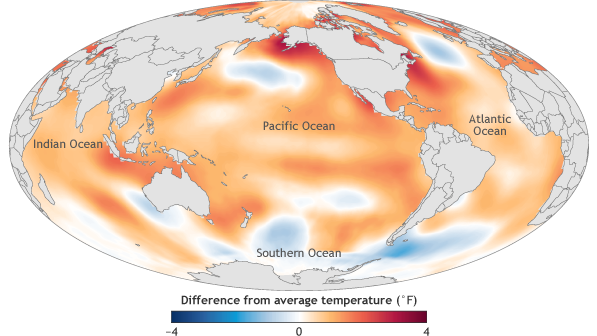
2016 surface temperatures
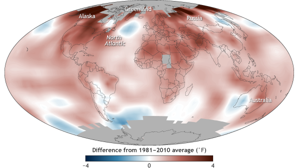
Global surface temperature in 2016 compared to the 1981-2010 average. NOAA Climate.gov map, based on data provided by Robert Dunn.
The report found that the major indicators of climate change continued to reflect trends consistent with a warming planet. Several markers such as land and ocean temperatures, sea level and greenhouse gas concentrations in the atmosphere broke records set just one year prior.
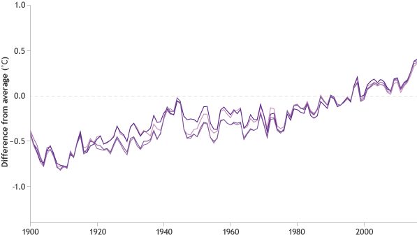
History of global surface temperatures since 1900
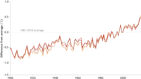
Yearly surface temperature since 1900 compared to the 1981-2010 average. In 2016, the global surface temperature was 0.45°–0.56°C (0.8°–1.0°F) above the 1981–2010 average—a new record high, according to multiple independent datasets. NOAA Climate.gov graphic, adapted from Figure 2.1a in State of the Climate in 2016.
These key findings and others are available from the State of the Climate in 2016 report released online today by the American Meteorological Society (AMS).
The 27th annual issuance of the report, led by NOAA National Centers for Environmental Information, is based on contributions from nearly 500 scientists from more than 60 countries around the world and reflects tens of thousands of measurements from multiple independent datasets (full report). It provides a detailed update on global climate indicators, notable weather events and other data collected by environmental monitoring stations and instruments located on land, water, ice and in space.
The report’s climate indicators show patterns, changes and trends of the global climate system. Examples of the indicators include various types of greenhouse gases; temperatures throughout the atmosphere, ocean, and land; cloud cover; sea level; ocean salinity; sea ice extent; and snow cover.
Report highlights include these indications of a warming planet:
Greenhouse gases were the highest on record. Major greenhouse gas concentrations, including carbon dioxide (CO2), methane and nitrous oxide, rose to new record high values during 2016. The global annual average atmospheric CO2 concentration was 402.9 parts per million (ppm), which surpassed 400 ppm for the first time in the modern atmospheric measurement record and in ice core records dating back as far as 800,000 years. This was 3.5 ppm more than 2015, and it was the largest annual increase observed in the 58-year record.
Global, monthly carbon dioxide since 1980
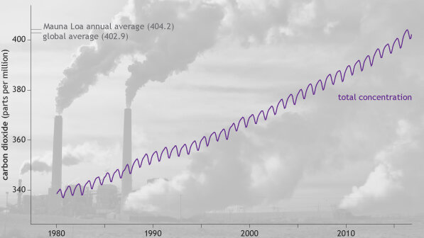
Global average carbon dioxide each month since 1980. NOAA Climate.gov graphic, based on data provided by NOAA ESRL. Photo of Cholla power plant in Arizona by John Fowler available through a Creative Commons license.
Global surface temperature highest on record. Aided by the strong El Niño early in the year, the 2016 annual global surface temperature observed record warmth for a third consecutive year, with the 2016 annual global surface temperature surpassing the previous record of 2015. Many places experienced record numbers of extremely hot days.
Extremely hot days in 2016
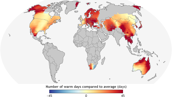
The number of extremely warm days (temperature above the 90th percentile in 2016 compared to the 1961-1990 average. NOAA Climate.gov graph adapted from Figure 2.1c in State of the Climate in 2016. Based on data provided by Robert Dunn.
Increasing frequency of very hot days
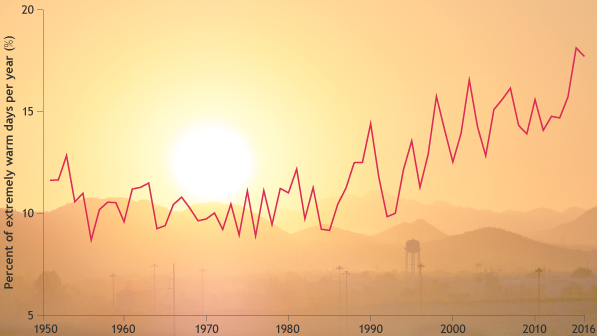
As the global average temperature has risen, so has the number of extremely hot days that occur each year. This graph tracks the changing frequency of days on which the temperature was in the 90th percentile of the historical record since 1950. Graph by NOAA Climate.gov, adapted from Plate 1.1g in State of the Climate in 2016. Background photo by Bob James via a Creative Commons license.
Global lower tropospheric temperature highest on record. In the region of the atmosphere just above the Earth’s surface, the globally averaged lower troposphere temperature was highest on record. Meanwhile, sea surface temperatures were also highest on record. The more recent global sea surface temperature trend for the 21st century-to-date (2000-2016) of +2.92°F (1.62°C) per century is much higher than the longer term (1950-2016) warming trend of +1.8°F (1.0°C) per century.
2016 ocean temperatures set new record high
Ocean surface temperature in 2016 compared to the 1981-2010 average. NOAA Climate.gov map, adapted from Figure 3.1a in State of the Climate in 2016.
History of sea surface temperatures since 1900
Sea surface temperature each year since 1900 compared to the 1981-2010 average. NOAA Climate.gov graphic, adapted from Figure 2.1e in State of the Climate in 2016.
Global upper ocean heat content near-record high. Globally, upper ocean heat content saw a slight drop compared to the record high set in 2015, but reflected the continuing accumulation of thermal energy in the top 2,300 feet (700 meters) of the ocean. Oceans absorb more than 90 percent of Earth’s excess heat from global warming.
Near record high ocean heat storage in 2016
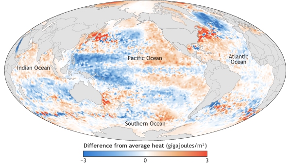
Heat energy in the global ocean in 2016 compared to the 1981-2010 average. Map by NOAA Climate.gov, adapted from Figure 3.4a in State of the Climate in 2016.
Upper ocean heating faster than deep ocean
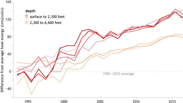
Yearly ocean heat storage compared to the 1993 average from a variety of data sets. The upper ocean (surface–2,300 feet; red lines) is picking up heat from the atmosphere more quickly than the deeper ocean (2,300–6,600 feet; orange lines)—consistent with heating from the atmosphere above. NOAA Climate.gov graph adapted from Figure 3.16a-b from State of the Climate in 2016.
Global sea level highest on record. Global average sea level rose to a new record high in 2016 and was about 3.25 inches (82 mm) higher than the 1993 average, the year that marks the beginning of the satellite altimeter record. This also marks the sixth consecutive year, global sea level has increased compared to the previous year. Over the past two decades, sea level has increased at an average rate of about 0.13 inch (3.4 mm) per year, with the highest rates of increase in the western Pacific and Indian Oceans.
Sea level patterns in 2016
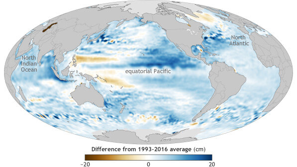
Global sea level in 2016 compared to the 1993-2016 average. NOAA Climate.gov graphic, adapted from Figure 3.16a in State of the Climate in 2016.
Meltwater and thermal expansion driving sea level rise
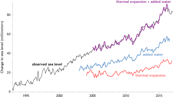
Global sea level since the start of the satellite record in 1993 (black line). Independent estimates of the amount of the trend due to thermal expansion (water volume increasing due to warming) are shown in red. The blue line shows an independent estimate of the amount of water being added to the ocean by melting of ice sheets and glaciers. The purple line shows the sum of the two contributions and how well the estimate matches the satellite observation. NOAA Climate.gov graphic, adapted from Figure 3.15a in State of the Climate in 2016.
Extremes were observed in the water cycle and precipitation. A general increase in the water cycle (the process of evaporating water into air and condensing it as rain or snow), combined with the strong El Niño, enhanced the variability of precipitation around the world. In addition to many parts of the globe experiencing major floods in 2016, for any given month at least 12 percent of global land was experiencing at least “severe” drought conditions, the longest such stretch in the record. Drought conditions were observed in northeastern Brazil for the fifth consecutive year, making this the longest drought on record in this region. The increased hydrologic cycle was also reflected, as it has been for more than a decade, by patterns of salinity (saltiness) across the globe’s ocean surface.
Extensive drought in 2016
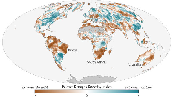
Areas experiencing drought in 2016 compared to average conditions for that region from 1901-2016. NOAA Climate.gov map, adapted from Figure 2.1q in State of the Climate in 2016.
Record-long stretch of severe drought over 12% of land surface
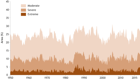
Percent of the global land area experiencing moderate, severe, or extreme drought each month from 1950–2016. NOAA Climate.gov graph adapted from FIgure 2.29 in State of the Climate in 2016.
The Arctic continued to warm; sea ice extent remained low. The average Arctic land surface temperature was 3.6°F (2.0°C) above the 1981-2010 average, breaking the previous record of 2007, 2011 and 2015 by 1.4°F (0.8°C), representing a 6.3°F (3.5°C) increase since records began in 1900. Average sea surface temperatures across the Arctic Ocean during August in ice-free regions ranged from near normal in some regions to around 13° to 14°F (7° to 8°C) above average in the Chukchi Sea and eastern Baffin Bay off the west coast of Greenland, and up to 20°F (11°C) above average in the Barents Sea.
Increasing temperatures have led to decreasing Arctic sea ice extent and thickness. On March 24, the smallest annual maximum sea ice extent in the 37-year satellite record was observed, tying with 2015 at 5.61 million square miles, 7.2% below the 1981-2010 average. On September 10, Arctic sea ice annual minimum extent tied with 2007 for the second lowest value on record, at 1.60 million square miles, 33 percent smaller than average. Arctic sea ice cover remains relatively young and thin, making it vulnerable to continued extensive melt.
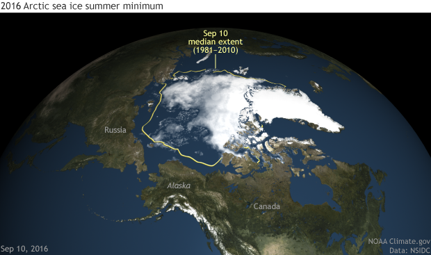
Arctic sea ice concentration on the date of the 2016 minimum extent, September 10, 2016. NOAA Climate.gov image based on NOAA and NASA satellite data from NSIDC.
Antarctic sees record low sea ice extent. During August and November, record low daily and monthly sea ice extents were observed, with the November average sea ice extent significantly smaller (more than 5 standard deviations) than the 1981-2010 average. These record low sea ice values in austral spring 2016 contrast sharply with the record high values observed during 2012-2014.
Ice and snow declining. Preliminary data indicate that 2016 was the 37th consecutive year of overall alpine glacier retreat across the globe, with an average loss of 2.8 feet (852 mm) for the reporting glaciers. Across the Northern Hemisphere, late-spring snow cover extent continued its trend of decline, with new record low April and May snow cover extents for the North American Arctic. Below the surface, record high temperatures at the 20-meter (65-feet) depth were measured at all permafrost observatories on the North Slope of Alaska and at the Canadian observatory on northernmost Ellesmere Island.
Ice loss from mountain glaciers
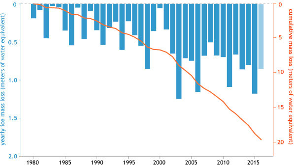
Glacier mass balance—the difference between ice lost through melting and ice gained through new snowfall—each year since 1980 (blue bars) for the 44 glaciers in the World Glacier Monitoring Service's reference network. Data from 2016 are preliminary. The orange lines shows the running total ice mass loss between 1980–2015. These glaciers have lost 18.8 m water equivalent (w.e.), the equivalent of cutting a 21-m (nearly 70-foot) thick slice off the top of the average glacier. NOAA Climate.gov graph adapted from Figure 2.13 in State of the Climate in 2016.
Northern Hemisphere snow cover below average
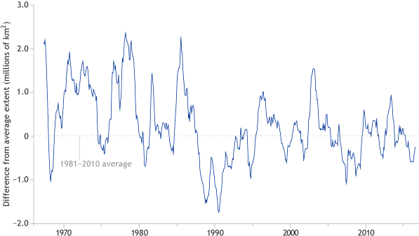
Monthly snow cover extent over the Northern Hemisphere relative to their 1981-2010 averages. NOAA Climate.gov graphic, adapted from Figure 2.12 in State of the Climate in 2016.
Tropical cyclones were well above average overall. There were 93 named tropical cyclones across all ocean basins in 2016, well above the 1981-2010 average of 82 storms. Three basins—the North Atlantic and eastern and western North Pacific—experienced above-normal activity in 2016. The Australian basin recorded its least active season since the beginning of the satellite era in 1970.
The State of the Climate in 2016 is the 27th edition in a peer-reviewed series published annually as a special supplement to the Bulletin of the American Meteorological Society. The journal makes the full report openly available online.