Where are the highest chances for a hot summer in 2017?
Schools are letting out, Memorial Day is nearly here, and for many Americans that means the unofficial start of summer. And if it's summer, then it 's time to start paying attention to the risk of extreme heat. According to NOAA’s summer outlook, most of the United States is favored to have a hotter than average summer in 2017. Only in the Great Plains do forecasters think the chances for a cool or a normal summer are equal to the chances of a hot summer. Everywhere else—from Alaska to southern California, and from Maine to Texas—odds are tilted toward well above average warmth. The absolute highest chances for a much warmer than usual summer are in Hawaii. (see the large version of the map below for Hawaii and Alaska.)
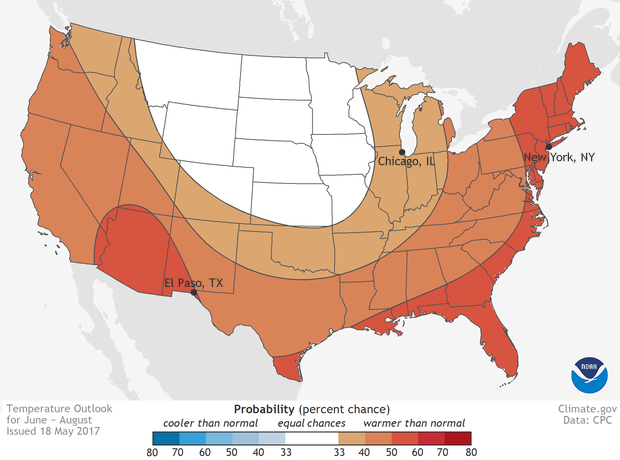
Map showing the odds of well above average temperature during summer of 2017. Well above average means "in the upper third of the 1981-2010 climate record." White shows areas with equal chances for any of the possible climate outcomes (cool, warm, or normal). Darker red colors mean higher chances (greater confidence). NOAA Climate.gov map, based on data from the Climate Prediction Center.
Darker colors mean higher chances, not bigger departures from average temperature
The orange and red colors on the map show where the chances of a much warmer than average summer exceed 33%. The darker the color, the greater the chances. Areas colored white mean that forecasters think all three temperatures possibilities—colder than normal, near normal, and hotter than normal—have an equal chance of occurring. In other words, the climate system is not leaning one way or another.
A static map can only show the percent chance for one of the three possible temperature outcomes, so the colors are determined by which outcome is more likely. That doesn't mean there is no chance of a normal or even a cooler than normal summer. The complete forecast includes the odds of all three temperature (and precipitation) categories. (We covered this in more detail in last year's summer outlook if you want to dig into the math). NOAA's Climate Prediction Center, which issues these forecasts, is experimenting with interactive maps as a way of sharing the full suite of forecast probabilities.
Full suite of temperature probabilities for select cities: Summer 2017 |
|||||
| POSSIBLE OUTCOME | Los Angeles | Seattle | El Paso | Chicago | New York |
| well above average | 48% | 40%* | 51%* | 36% | 55% |
| near average | 33% | 33% | 33% | 33% | 33% |
| well below average | 19% | 27% | 16% | 31% | 12% |
For every U.S. location, NOAA's forecasts the probability for all three possible temperature outcomes: well above average, near average, and well below average. When all three probabilities are equal (33% chance) the map is colored white. Otherwise, the map colors represent the category with the highest chances. NOAA Climate.gov table, based on values pulled form CPC's prototype interactive map viewer. *CORRECTION: Jun. 7, 2017. Due to a coding error, the table originally had incorrect values for Seattle and El Paso for the chances of "well above average" temperatures. They were both shown as having a 48% chance, instead of 40% and 51%, respectively.
Well above and well below mean “in the upper or lower third of the climatological record,” which currently spans the 30-year period 1981-2010. Although the cutoffs for what counts as “lowest third” and “highest third” may only be separated by a few degrees, remember that averaging can smooth out a lot of day-to-day variability. A couple of degrees difference in the summer average is likely to smooth out a big difference in daily heat extremes. Below are a few examples from U.S. cities.
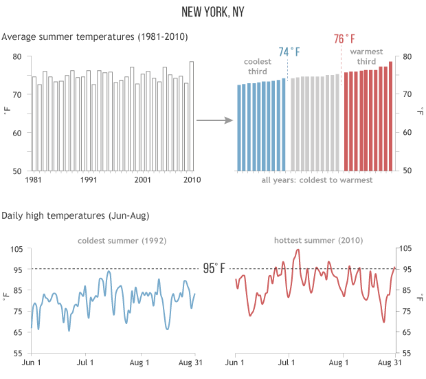
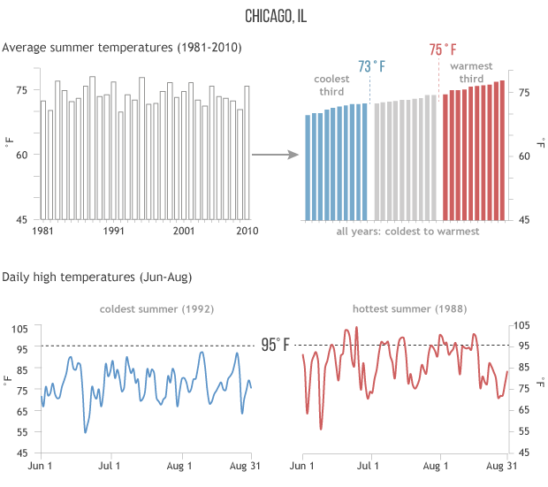
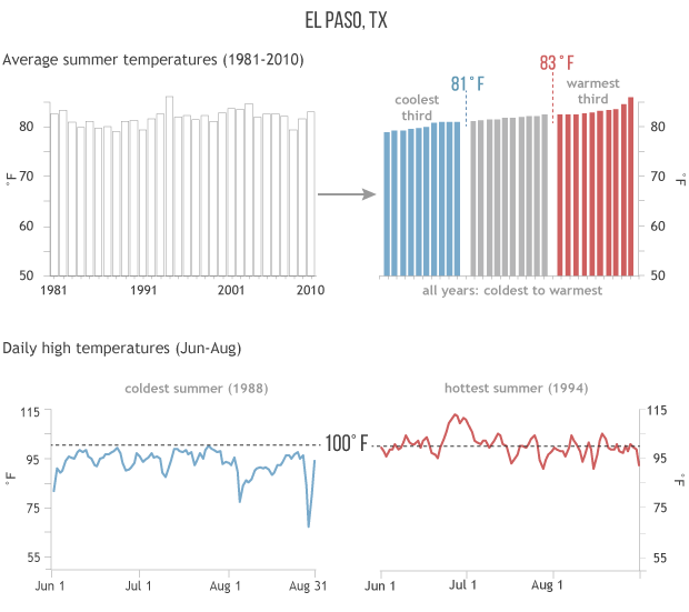
In each image, the top left corner shows the average summer temperatures each year in the vicinity of the city* from 1981-2010, and the top right corner shows those same data sorted from coldest year to hottest year. The record is split into thirds to create the “bins” for the forecast categories: bottom third (well below average), middle third (near average), and top third (well above average).
The bottom panels show the daily data for each city’s coldest (left) and hottest (right) summer of the 1981-2010 period. El Paso had its coldest summer in 1988, with an average temperatures of 79° F. it’s hottest summer of the period, with an average temperature of 86° F, was 1994.
To really get a sense of what the city’s residents—especially outdoor workers, exercisers, older people, and other vulnerable populations—would have been struggling with day to day, pay attention to the number of days that summer when the day time high temperature climbed over 100°F.
When it comes to heat stress, nighttime matters, too
There is more than one way to define a “heat wave,” since what counts as “extreme heat” depends not just on location and air temperatures, but also on how humid it is, whether there is a breeze, and how sunny or overcast it is. One factor that public health experts say is critical is the overnight low temperature. When it doesn’t cool off at night for at least a few hours, an extended hot spell can become especially dangerous. It’s a situation that global warming is making more common.
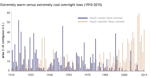
The percent of the contiguous United States recording extremely warm overnight lows in summer (peach bars) has been increasing over the past century. Meanwhile the percent of the contiguous United States recording extremely cool overnight lows (blue bars) is getting smaller. NOAA Climate.gov graph, based on data from the Climate Extremes Index tool from the National Centers for Environmental Information.
If you are interested in learning more about tools and strategies for protecting yourself or your community from heat-related illnesses this summer, hop on over to the U.S. Climate Resilience Toolkit and check out the resources available from the National Integrated Heat Health Information System (NIHHIS), a collaboration between NOAA, the CDC, FEMA, and other partners. A portal to all things heat health, NIHHIS was created to help decisions makers prepare for extreme heat events days, months, and years into the future.
*About these data
These graphs are based on data captured “mid-stream” from the forecast software from NOAA’s Climate Prediction Center. The values represent the average temperatures for the 0.5° map pixel that includes the given city. Because of spatial averaging and gridding, these values may differ somewhat from the official climate division or Global Historical Climatology Network records for these cities.