Weather repetitions and climate fitness
Happy New Year from the ENSO Blog! With the arrival of the new year and an ongoing strong El Niño, many folks are already asking us, why isn’t the current El Niño bringing the expected wetter/drier/warmer/cooler conditions over my house yet?!
- First, we’ve already seen impacts consistent with El Niño across much of the globe and those impacts have been occurring for some time now. A quick look around the world indicates some very El Niño-like impacts over the past half year (footnote #1).
- Second, we’re two-thirds through January as of this writing, which means we’re barely past the midway point in the December-February season. We’ve basically just entered the January-March season when the U.S. El Niño impacts are most widespread (El Niño’s sea surface temperature typically peaks a couple of months earlier, but there’s a lag). It’s just too soon to say much because, as we’ve discussed, ENSO is a seasonal climate phenomenon and primarily impacts seasonal climate averages. That’s right—ideally, we wait *three whole months* (footnote #2) to look back and examine a given winter’s consistency with the historical El Niño impacts (footnote #3).
With that said, we totally understand the curiosity about whether El Niño impacts are being felt or if factors other than El Niño will wind up dominating this winter. I will admit to staring at the near-term weather forecasts a bit too often over the past couple weeks (hooray for mid-Atlantic snow!).
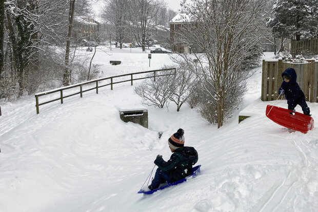
Happy children enjoying a weather event that provided at least 4 inches of new snowfall (two storms in one week in the DC area!). They've said their prayers to the deities of El Nino and the polar vortex to produce similar snowy events this winter. Photo credit: M. L'Heureux.
But I have to remind myself that weather and climate are two very different things. It’s not easy! After all, our lived experience from day to day, what we see and feel, is the weather. It’s a bit harder to “feel” the climate, which is the average of weather over different spans of time (footnote #4). I don’t generally go on a stroll in the morning and think to myself, “I better bring a raincoat because today’s 1-month average sure feels wet.”
But those averages are the climate! And so, to understand the climate, we have to examine longer time periods. If this is still a bit confusing, I’m going to try out an analogy. And if it is lousy, you can immediately close your browser window and we will forget this ever happened.
Hit the gym
In honor of the New Year, many of us make resolutions to improve ourselves over the coming year. A popular one is to become fitter, by eating more balanced meals and exercising. I’m in this category and in early January, I bought one of those 1-month reduced-price gym memberships because this is THE YEAR I will become fit enough to do a pull-up (footnote #5).
So, what does my New Year’s fitness resolution have to do with weather vs. climate? Well, let’s take a look at the animation below. What you are seeing here is an animation of daily-average weather (precipitation and pressure changes) from the 1st of December 2023 through the 20th of January 2024 (footnote #6).
#}Daily pressure patterns (highs in brown, lows in purple) and precipitation (grayscale) in Northern Hemisphere winter to date (2023-24). There's a lot of motion in this movie; lots of variability from day to day. That's the weather. Video by NOAA Climate.gov, adapted from original by Michelle L' Heureux.
The upshot of this animation is that the weather is chaotic and noisy! Look at all that movement, particularly outside of the tropics and in the middle-to-high latitudes! It’s dizzying. The division between the purple and oranges is where regions of higher pressure (orange shading) meet lower pressure (purple shading). This boundary is often the location of weather fronts which bring rapid changes in the weather. The most dramatic example of this tends to occur ahead of low-pressure systems (the purple shading) that bring rain or snow. Pretty cool, isn’t it?
The movement in this map is a lot like me actively doing some crunches or repetitions on a weight machine at the gym on a certain day. I’m moving, it’s happening! My physical activity over 1 day is super high! If I go to the gym enough, I’m going to be able to do that pull-up! But, oh wait…
Portion control
It’s now two weeks into my resolution and I’ve skipped a few workouts and–confession–there were a few nights in a row when I consumed that extra-large cheesy pizza. Now maybe I’m a little behind on my goals and feeling a bit more sluggish. It’s not a total loss—after all I did do some of my daily workouts. But my physical activity is lower over the 2-week average than for the days that I went to the gym. By evaluating our physical activity over longer spans of time (our overall fitness), we are now shifting from weather to climate timescales.
#}2-week rolling averages of pressure patterns (highs in brown, lows in purple) and precipitation (grayscale) in Northern Hemisphere winter to date (2023-24). Compared to the daily animation, changes have slowed down, like we're playing back the daily animation at half speed. That's still weather, but we're shifting toward climate. Video by NOAA Climate.gov, adapted from original by Michelle L' Heureux.
The 2-week average animation above is made up of the exact same data as in my 1-day animation except now I’m averaging together 14 days in a row and then sliding this 14-day average forward one day at a time. So, December 1- 14th is the first snapshot, then December 2nd-15th is the second snapshot, etc. What do you notice here?
You may notice that the animation changes a lot more slowly. The chaos inherent in the daily animation is much reduced. There is still movement, but not as much. Some interesting aspects of this animation is the precipitation we see in the global tropics. If you watch it loop a few times you will notice in that you see a distinctive dark band of shading across the tropical Pacific Ocean—these are clusters of storms that have been generally more active (see Emily’s recent post) because of the ongoing El Niño!
As we slide forward in time, we can see the storminess in the tropical Pacific Ocean becomes reduced and, gradually, the storm cluster over the tropical Indian Ocean gets stronger and then starts shifting toward Indonesia. What is this? This fluctuation is, in part, driven by the Madden-Julian Oscillation (MJO), which is a dominant driver of the tropical climate (and an important factor in U.S. conditions) on “sub-seasonal” timescales. Fancy word, but all “sub-seasonal” means is that we are looking at climate averages shorter than a season, such as two weeks or a month. In the first half of January, the MJO was moving into locations (we describe them as phases) that enhance rainfall in the Indian Ocean/Indonesia and suppress it over the tropical Pacific—a geographic arrangement that opposes the effects of El Niño.
There are a lot of interesting features in this animation, but since we are a United States-based blog, let’s shift our attention the U.S. From mid-December through the beginning of January, we saw lower pressures (purple shading) dominate the eastern North Pacific Ocean (off the West Coast). We saw a similar area of lower pressure near the southeastern United States. Over Canada and the northern tier of the U.S., there was a region of higher pressures. This observed pattern overlapped strongly with the expected El Niño pattern. However, since early January, we’ve seen that atmospheric pattern break down, likely partially due to the MJO.
Slow and steady wins the race
Let’s increase the averaging length further and move onto a monthly (4-week) average. Now it’s harder to see the sort of drastic changes that are obvious in daily or 2-week averages.
#}Rolling 4-week average of daily pressure patterns (highs in brown, lows in purple) and precipitation (grayscale) in Northern Hemisphere winter to date (2023-24). Compared the daily and even 2-week animations, changes are much more subtle, like we've switched to 1/4 speed slow motion. Not weather, but not yet a full season (which is the climate period El Niño forecasters pay attention to), a month is typically described as "sub-seasonal" climate. Video by NOAA Climate.gov, adapted from original by Michelle L' Heureux.
The band of tropical precipitation is steadier and is more consistent with the typical conditions this time of year (though El Niño enhances rainfall over the equatorial Pacific Ocean). Over North America, we see a persistent pattern of higher pressure over Canada and the northern tier of the U.S., with lower pressure over the eastern Pacific and southern U.S. We can also see higher amounts of precipitation in the southeastern U.S. These are all features consistent with El Niño that were more difficult to spot in the daily or two-week averages!
So, here at the monthly level, we have hints of an El Niño influence, but we need to still remember El Niño describes only a small part of sub-seasonal variability. It is very common to see variations in the 4-week average within a season and these may have nothing to do with El Niño.
So, can you do that pull-up now?
No, not yet. While the chances (probabilities) are in favor of me getting closer to my fitness goal the more I go to the gym and eat right, it doesn’t mean I’ll be able be fit enough to do a pull-up by the end of the year. In the same fashion, weather patterns can average over time to be consistent with the influence of El Niño, but rarely do they perfectly match El Niño expectations (see Nat’s awesome blog post that illustrates how much “matching” we can expect between U.S. precipitation and ENSO). Why is that?
Well, go back to that 1-day animation map and stare at it some more. Weather is chaotic! If I told you that on a certain day, one month from now, a cold front will move through the central Plains and it’ll be rainy and 35° Fahrenheit, you should laugh me out of the room. El Niño is never going to tell you what the WEATHER will be on a certain day. What El Niño can tell us is that, for seasonal averages, chances favor more storm systems and precipitation over the southern tier of states in the winter/early spring (along with these other impacts).
But just like my 1-day workout in the gym isn’t going to tell me whether I will be fit enough to do a pull-up by the end of the year, looking at short spans of time isn’t necessarily going to reveal whether El Niño left its mark. It’ll be the average of my eating habits and workouts (weather) that tells the story of my overall fitness (climate). And, even then, there might be surprises in store: my fitness could deteriorate for some other reason like illness or injury—things that are unpredictable. On that uplifting note, Happy New Year! I’m going to hit the gym.
Footnotes:
(1) Some impacts that are likely partially attributable to (consistent with) El Niño relationships include:
- decreased precipitation and drought across northern areas of South America and parts of Central America since at least June 2023.
- flooding rains and increased precipitation near the Horn of Africa in October-November 2023.
- drier conditions around Indonesia and the Philippines since August 2023.
- drier conditions over Australia during August-October 2023.
- wetter conditions across southern India and Sri Lanka during October-December 2023.
- increased precipitation near Uruguay/southern Brazil since September 2023.
- a boost in global mean temperatures.
Also read footnote #3 and realize many of these impacts also occur within a warming world so cannot be solely attributed to El Niño (see this interesting recent analysis on the Amazon).
(2) This can be confusing, but when we say “seasons” we mean any 3-month period. Not the conventional “winter,” “summer,” etc. A season here can be December-February, January-March, February-April, March-May… you get the picture.
(3) To be clear, consistency with historical El Niño impacts is a pretty low bar for determining whether anomalies were driven by El Niño. To get more serious about attribution, one could run models driven with observed tropical Pacific Sea surface temperature (like what was shown in this post) to see what degree the climate response to the sea surface temperatures matched both the expected El Niño signal and what actually occurred.
(4) I’m simplifying here a bit by saying it’s just “averages.” Climate can be defined by other metrics that make up a probability distribution. For example, we could look at changes in the variability (variance/standard deviation) over different time spans.
At the Climate Prediction Center, we have all sorts of outlooks, from one-week averages, two-week averages, monthly averages, and seasonal averages. And, then of course, there is longer-term climate changes that capture our attention because, well, the world is warming up and it’s going to have consequences.
(5) Ha ha. This is a total lie. I will never be able to do a pull-up as long as I live. But I’m going to try to be healthier and that’s good enough for me.
(6) As a friend points out, to make this a better analogy, we’d start this loop on January 1st. He also says the animation loop should end when everyone gives up their New Year’s resolutions.
Comments
Factors
This was an interesting post, especially with the two week and one month animations you provided. It looks like daily variations largely go away if you average readings over longer periods of time, which helps you to see bigger patterns.
As well, by looking at them and reading this post (and previous ones), it sounds like El Niño and the MJO are factors that influence our weather (with their effects becoming more apparent when looking at two week or monthly averages). From reading the stratospheric polar vortex blog, it looks like the SPV is a factor as well. And, human-caused global warming is another factor (albeit one that is getting bigger over time). There are probably other ones, too.
Is all of this correct?
Regardless, thanks for putting this post together, and for explaining things.
Thanks Matt! You hit the…
Thanks Matt! You hit the nail on the head that there tend to be different *drivers* (influencers) for different averaging periods. For example, one wouldn't lean on the polar vortex or MJO to make a seasonal forecast. There might be a few rare exceptions, say if the MJO was already in the *initial conditions* of a model run and was conducive to strong storms in a typically arid location. But, mostly, we do not know what the state of the SPV/AO/MJO/etc will be during the course of an entire season (90 day average) and it's also possible that, within the course of a season, changes in those phenomenon could cancel themselves out (The Arctic Oscillation/AO could be positive for the first half the season and then be canceled out by AO negative during the second half). So that's why we lean on factors like ENSO, trends, and other surface boundary conditions when we make a *seasonal* outlook.
Other factors?
Thanks for the explanation, and for clarifying that factors like the MJO and the SPV don't really play much of a role in seasonal forecasts.
You mentioned that ENSO is a factor that plays a role in seasonal forecasts, as well as "trends, and other surface boundary conditions..."
So, what are some other factors that affect seasonal forecasts?
Excellent question. One good…
Excellent question. One good example of something that can affect seasonal outlooks is soil moisture. Elevated or below-average levels of soil moisture can affect season temperature and precipitation predictions. The same goes for elevated coastal ocean temperatures.
thanks for putting this post…
thanks for putting this post together, and for explaining things.
Add new comment