Bitterly cold extremes on a warming planet: Putting the Midwest’s late January record cold in perspective
The record cold temperatures in the Midwestern United States in late-January led to over 20 fatalities and economic impacts likely to exceed $1 billion, according to one insurance industry estimate. Just how common are these cold records, and how do they compare to occurrences of warm records? What can these records tell us about climate change?
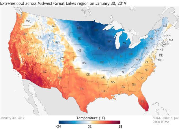
Daytime high temperature on January 30, 2019, based on NOAA Real-Time Mesoscale Analysis data. An analysis is a blend of observations and model output that is used as the "initial conditions" of the atmosphere for a given forecast period. Map by NOAA Climate.gov, based on RTMA data provided by Steve Levine/NCEP.
Fleeting—but record-setting—cold
One way we can answer these questions is to look at daily high and low temperature data from the Global Historical Climatology Network – Daily database. For this analysis, we only included stations from the Global Climate Observing System Surface Network that are at least 80% complete from 1951-present, resulting in 369 land-based stations across the globe. Now let’s take a closer look at a few of these stations from the Midwest/Great Lakes region: Peoria, IL; Minneapolis, MN; and Pittsburgh, PA.
In Peoria, the daily low of -20°F on January 30, 2019, eclipsed the prior record of -12°F (set in 1966), while the day’s high of -6°F broke the previous record of 3°F (set in 1951 and tied in 2004). Collectively, 8 cold records were set in January for these 3 stations compared to only 2 warm records (see table below). A different story emerges if we consider the 12-month period ending January 31, 2019, during which 41 warm records occurred versus 24 cold records (including the 8 in January 2019) for these 3 stations.
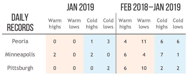
In Peoria and Pittsburgh, January 2019 brought more cold records than warm ones, while in Minneapolis, warm and cold records were tied. Over the last 12 months, however, warm records outnumbered cold ones in all three cities. In Pittsburgh, the ratio was especially lopsided, with 4 times as many warm records as cold ones.
The bigger picture
It is important to keep in mind that the parts of the U.S. hit by the cold snap are a small fraction of the global surface area. Moreover, it is not uncommon for localized incursions of Arctic air masses to be compensated for by warmer-than-normal conditions in other areas of the mid-latitudes. To help decide if the late January cold snap was consistent with large-scale climate impacts or not, we looked at a broader set of stations.
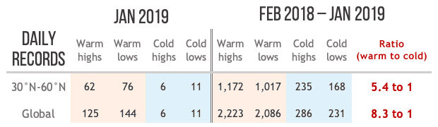
If we look at records across the entire Northern Hemisphere mid-latitudes (30°N-60°N), we indeed find that the greater-Midwest cold snap was an outlier (see table below) with respect to what was going on worldwide. In January 2019, a collective 138 warm records were set in the Northern Hemisphere mid-latitudes, compared to only 17 cold records—almost all of which occurred in the Midwest. Over the previous 12-month period, there were 5.4 times as many warm records as cold records in the region.
If we expand our view even farther, considering all of our study’s land-based stations across the globe, we find that there were 733% more warm records than cold records over the last 12 months, including numerous extreme heat warm records reported in Australia in December 2018 and January 2019.
The January 2019 cold snap in the Midwest and parts of Appalachia was a localized event. Across the entire Northern mid-latitudes (defined as the area from 30–60 degrees North), warm records were set far more often than cold ones were, and the ratio was even more lopsided for the globe as a whole.
Lopsided ratios of hot records to cold records
Ongoing research funded by NOAA’s Climate Program Office will provide an enhanced, operational analysis system for monitoring daily temperature records across the contiguous United States and monthly temperature records across the globe. The advantages of the new system are that it accounts for changes in observing practices at weather stations and it is based on a high-quality, high-resolution gridded data set.
In a gridded data set, the globe is divided into hundreds of small squares of comparable area, called "grids," and a sophisticated computer program averages and interpolates data from all nearby stations to come up with a best estimate of the temperature in each grid. This allows us to characterize the spatial extent of warm and cold records and how they are changing over time in a more objective way. Some preliminary results from the CPO-funded research project, based on analyses of 1951-2017, are presented below.
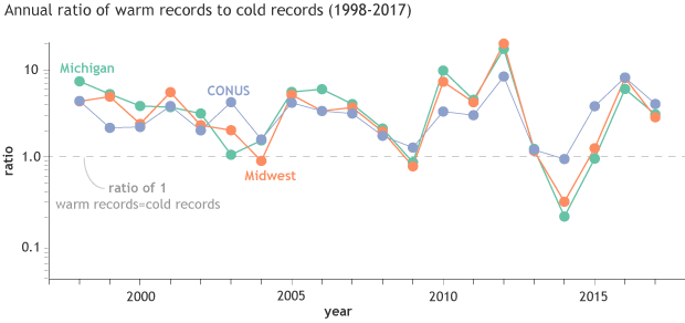
These traces show the ratio of warm records to cold records, by year since 1998, for three nested U.S. regions: Michigan (green), Midwest (orange) and Contiguous United States (blue). Points above the dashed 1.0 line represent years in which that region had more warm records than cold, while those below the line represent years with more cold records than warm. The logarithmic scale on the left indicates the magnitude of this ratio. Example: 10 represents ten times as many warm than cold records; 0.1 represents ten times as many cold than warm records.
The annual ratio of warm records to cold records from 1998-2017 has averaged about 4.4 to 1 across Michigan (another state impacted by the cold air blast of late January 2019), about 4.1 to 1 across the Midwest National Climate Assessment Region, and 3.3 to 1 across the continental United States (CONUS) (see graph above). The most lopsided warm-records-to-cold-records ratios (17.3 to 1, 19.9 to 1, and 8.4 to 1, for Michigan, the Midwest, and the CONUS, respectively) occurred in 2012, which also ranks as the warmest year on record for the CONUS. The year 2014 is a significant outlier, with cold records exceeding warm records by a 4.8-to-1 margin across Michigan and a 3.3-to-1 margin across the Midwest, although across the CONUS, there were only 6% more cold records than warm records.
Looking at monthly temperature records from the gridded version of the NOAAGlobalTemp dataset from 1998-2017, we are not able to provide meaningful ratios on a monthly or annual basis because the prevalence of cold records is much smaller than the frequency of warm records (see graph below). In fact, there were no cold monthly records for any grid cell in all of 2017. However, over the full 20-year period, we can say that there were 21.8 times as many warm records as there were cold records. The percentage of the globe experiencing extreme monthly temperatures has averaged about 6.8% for warm records in any given month from 1998-2017, whereas for cold events it has been only 0.3%.
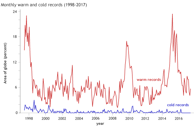
These graphs show the relative percentage of the Earth's surface experiencing record warm (red) and record cold (blue) monthly temperatures, by month since 1998. The percentage of earth's surface area experiencing record warmth dwarfs that of record cold in nearly every month during the 20-year period.
The planet is warming, but winter isn't going anywhere
If the global climate were not changing—the planet is warming—we’d expect the ratio of warm records to cold records to be close to 1 to 1 if we averaged over the span of several decades. Instead, the pattern we observe is that against the backdrop of a warming planet, daily cold records still occur, but at a considerably lower rate than daily warm records. In addition, as we consider larger areas (from stations to regions to countries to the globe) and longer time horizons (from daily to monthly to annually and beyond) the ratio of warm to cold records generally increases.
The bottom line is that there is nothing unusual about local daily cold records being set at the same time that global temperatures are warming. While warm records have become more common than cold records in a macro sense across space and time, cold records will continue to occur, even in winter, which isn’t going anywhere.
Comments
Temperature Records
RE: Temperature Records
Extend the data
RE: Extend the data
Climate change
Add new comment